형용사로서의 색채 VIII I Color as adjective VIII
Sep. 1 – Oct. 1, 2022
갤러리 와우 I Gallery Wow 서울시 마포구 와우산로 99
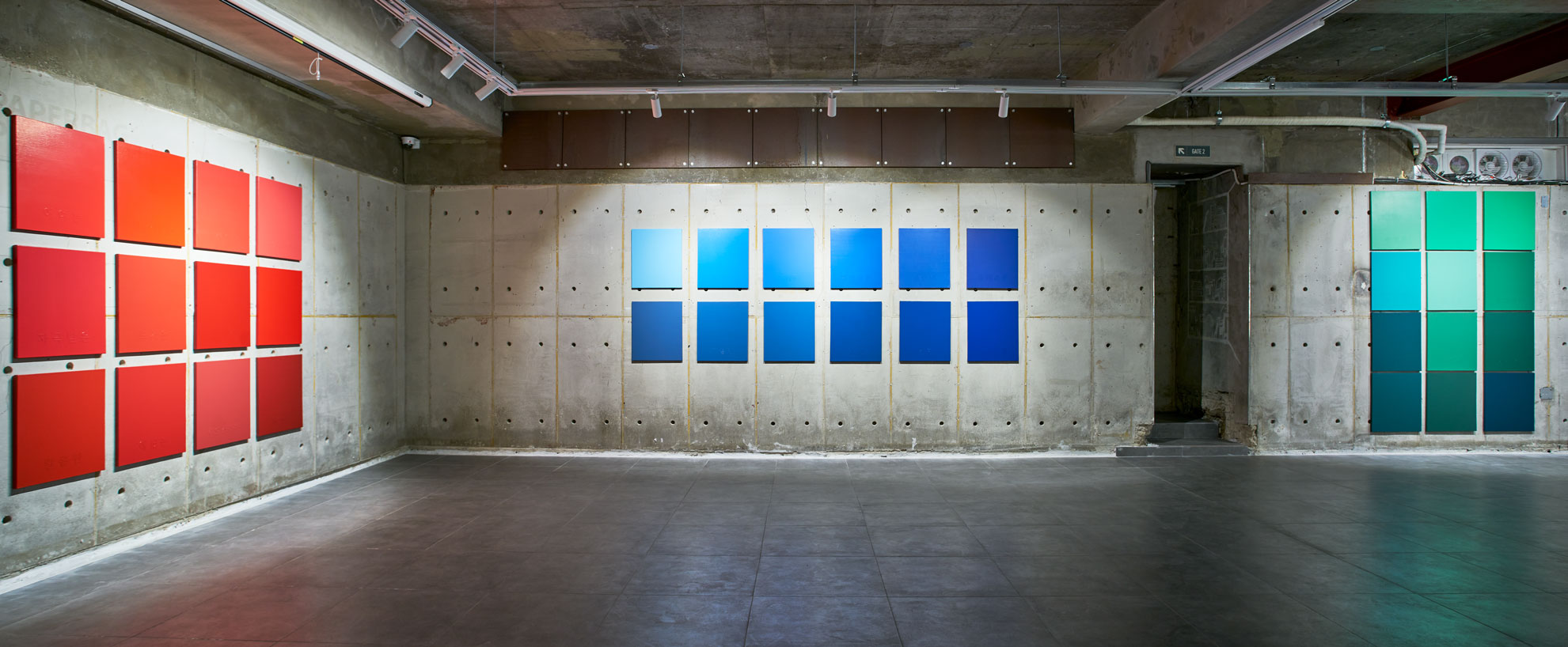
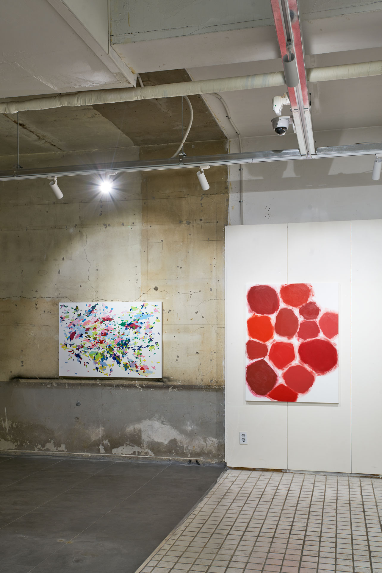
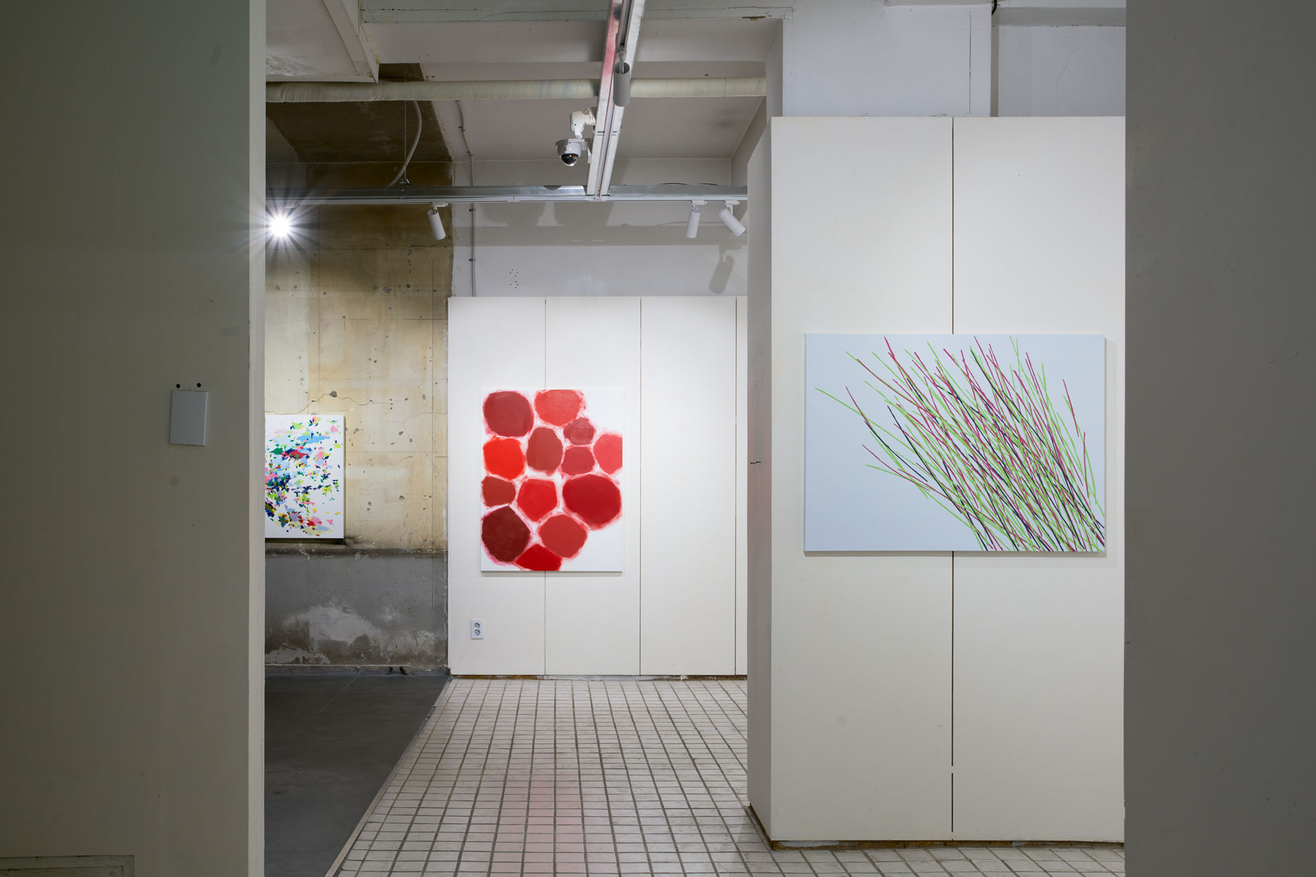
형용사로서의 색채-빨강, 파랑, 초록
지금까지 나의 주관적이고 불명확한 감정을 묘사하기 위해 형용사로서의 색채를 탐구해왔다. 2012년 첫 시도 이후 지금까지 10년의 시간 동안 기록된 색-감정의 관계는 어떤 개념으로 설정하는가에 따라 다양한 색의 관계를 실험할 수 있다.
가장 먼저 떠올린 형용사로서의 색채-명사는 아름다움이다. 현대 한국 사회는 변화무쌍하고 역동적이지만 예술가로서의 개인적인 삶은 형용사로서의 색채가 보여주는 것처럼 때론 기뻣지만 대부분 불편하고 우울한 경험이 많았다. 기쁨의 순간은 짧게 공기 중에 흩어지고 우울함은 깊은 내면에서 솟아 올라온다. 분노는 붉게 염색하듯 시야를 흐리게 하고 미래에 대한 불안은 신체 전체에 퍼져 불면의 밤을 선사한다.
그렇게 기록된 형용사로서의 색채 370여 개를 다시 바라보았을 때, 그동안 찾고자 노력했던 색-아름다움이 그곳에 있었다. 고통스러운, 아련한, 막막한, 어리석은, 친절한, 그리고 때론 평온했던 일상. 살아있기에 느낄 수 있었던 감정과 마음으로 바라볼 수 있었던 색의 조합-아름다움.
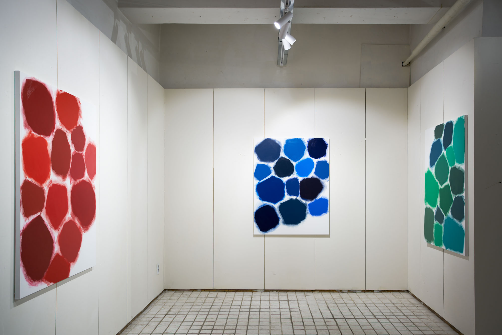
이번에는 색의 본질을 탐구하는 빨강, 파랑, 초록의 명사를 전시한다.
빛에 따라 색은 서로 다르게 보인다. 누가, 언제 보는가에 따라서도 다르게 보인다. 내게 중요한 것은 물리적인 특성로서의 색의 탐구가 아닌, 지금 나에게 그것이 어떻게 느껴지는가이다. 이 느낌은 매우 유동적이고 불명확하며 모호하다. 그래서 형용사다.
그렇게 만들어진 색-감정의 관계를 빨강, 파랑, 초록으로 정의한다. 이번 정의는 미래에는 변화될 수 있는 현재까지의 정의다.
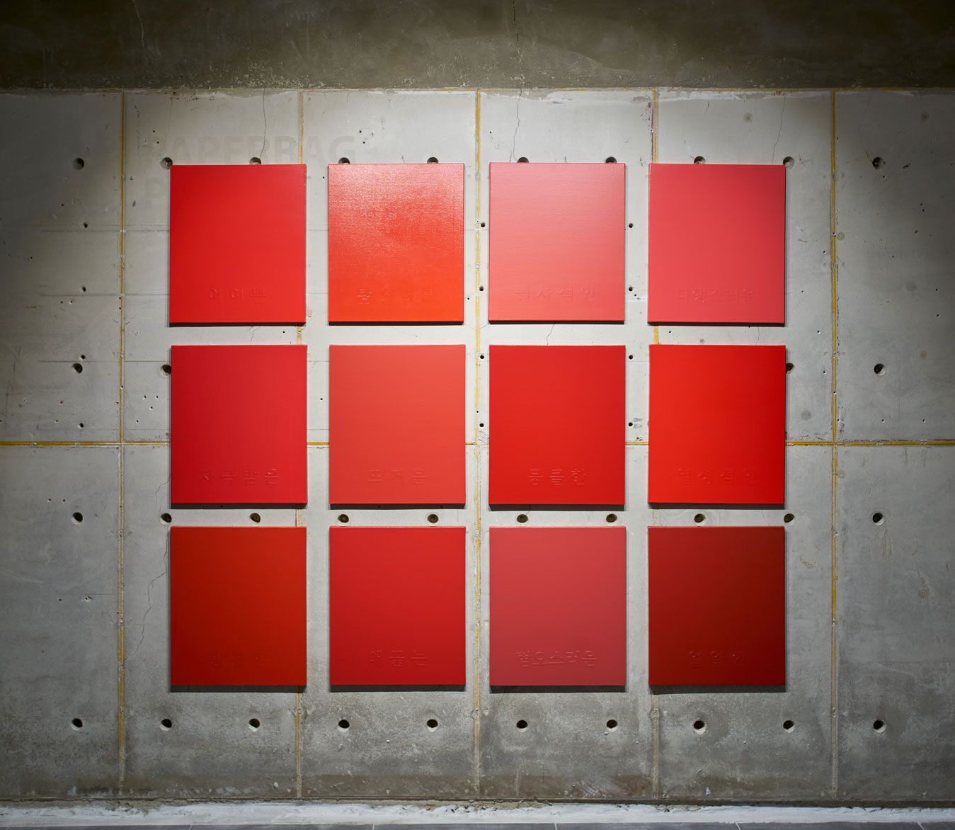
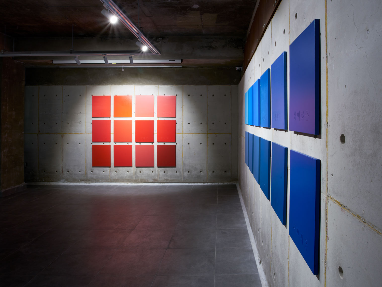
나에게 지난 10년간 [빨강]은 어여쁜, 탐스러운, 필사적인, 다행스러운, 자극받은, 뜨거운, 뭉클한, 열성적인, 황홀한, 애끓는, 혐오스러운, 얼얼한 색이었다.
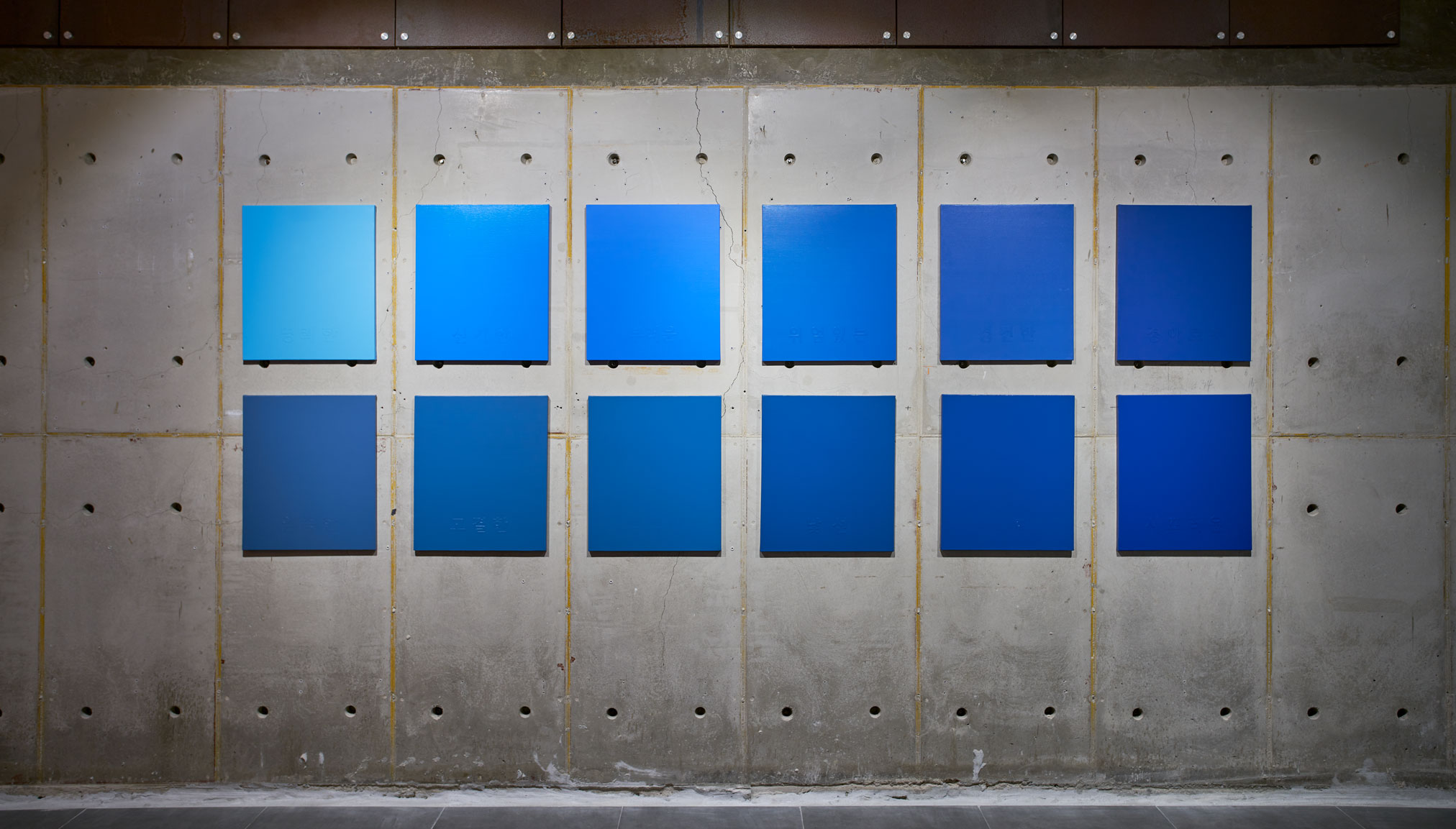
나에게 지난 10년간 [파랑]은 명쾌한, 신기한, 부러운, 위엄있는, 경건한, 경이로운, 엄중한, 고결한, 적적한, 낯선, 쎄한, 시끄러운 색이었다.
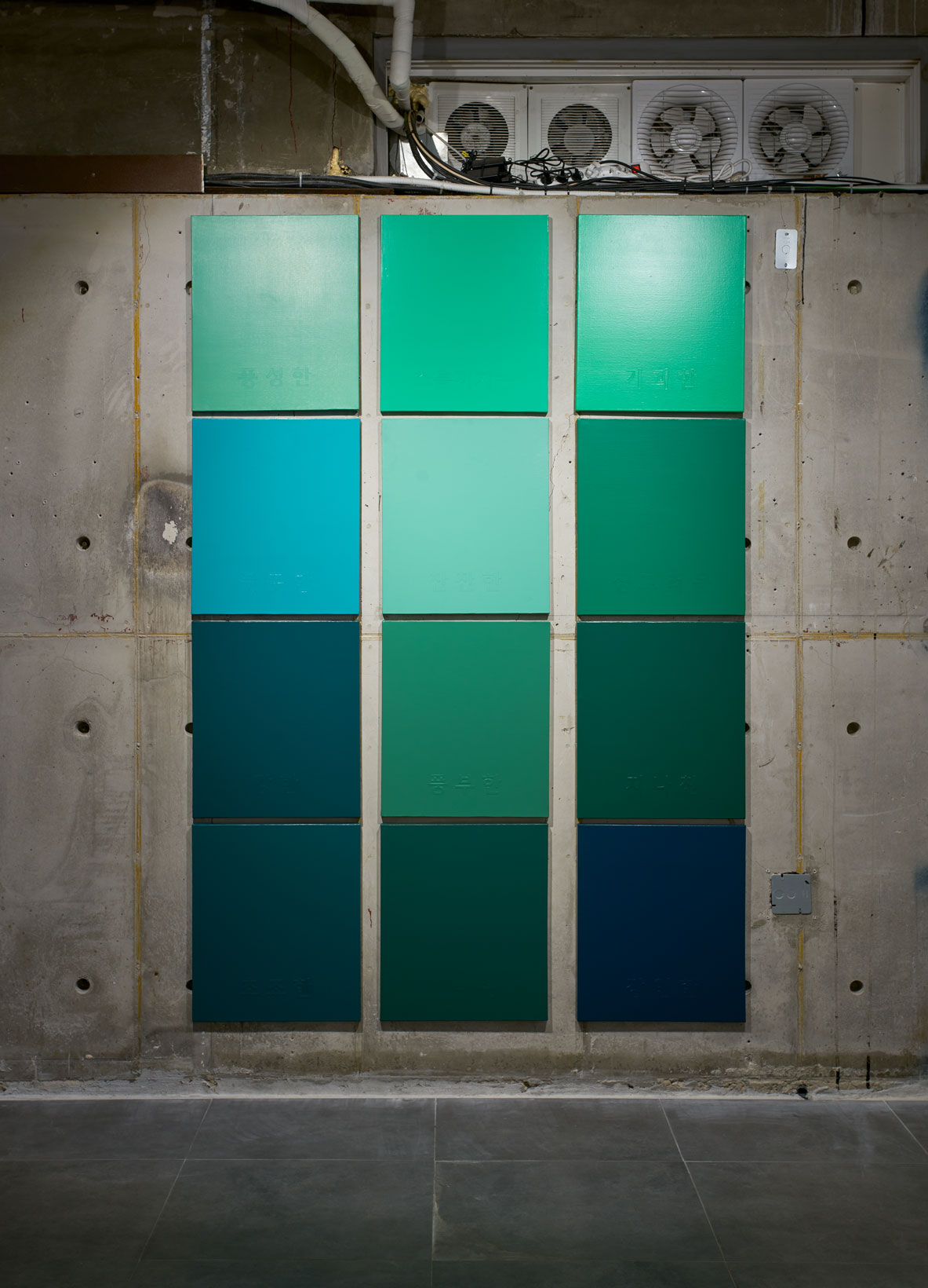
나에게 지난 10년간 [초록]은 풍성한, 소름끼치는, 기괴한, 풋풋한, 잔잔한, 싱그러운, 강한, 풍부한, 지나친, 초조한, 아쉬운, 강인한 색이었다.
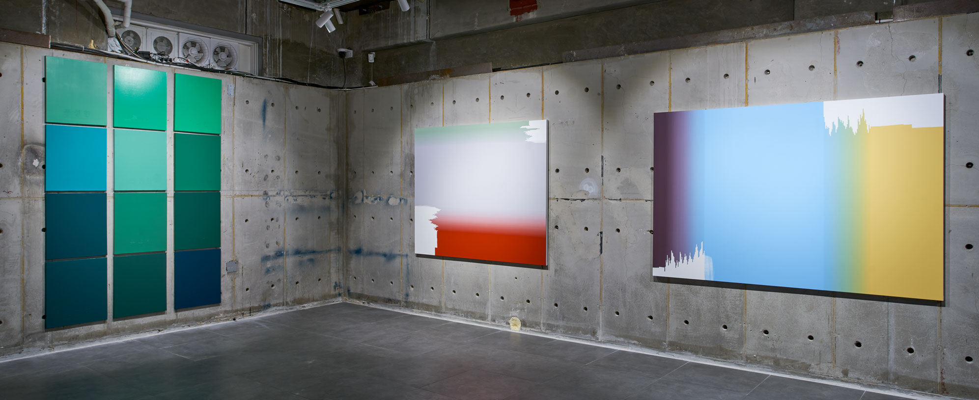
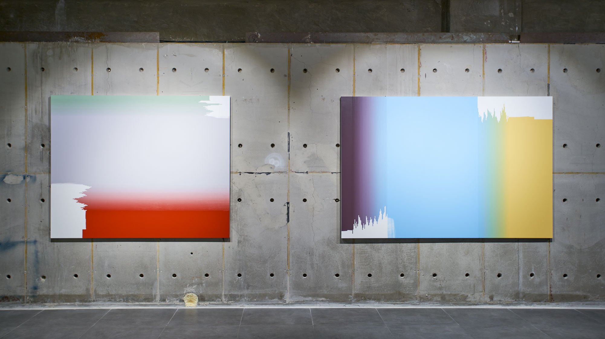
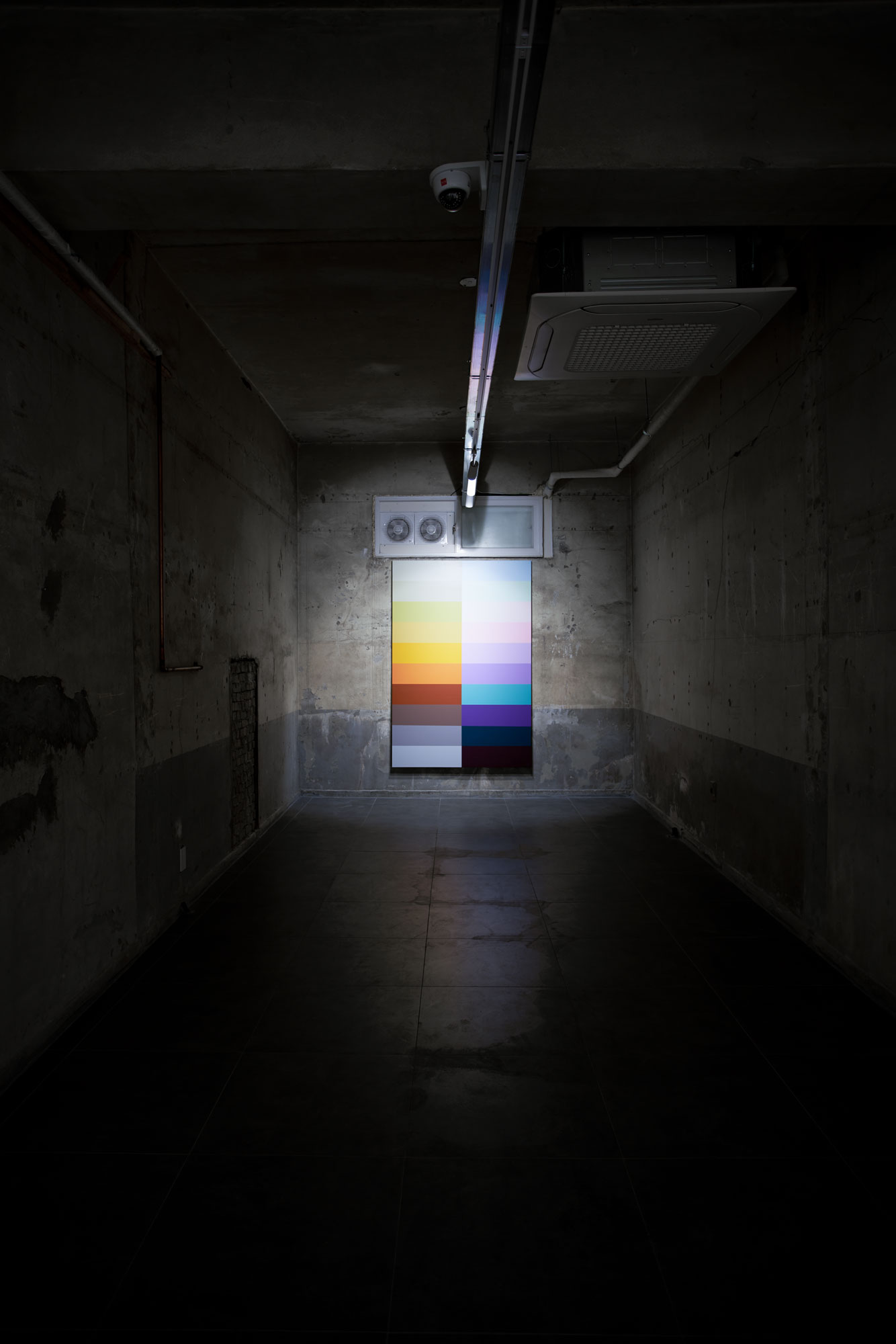
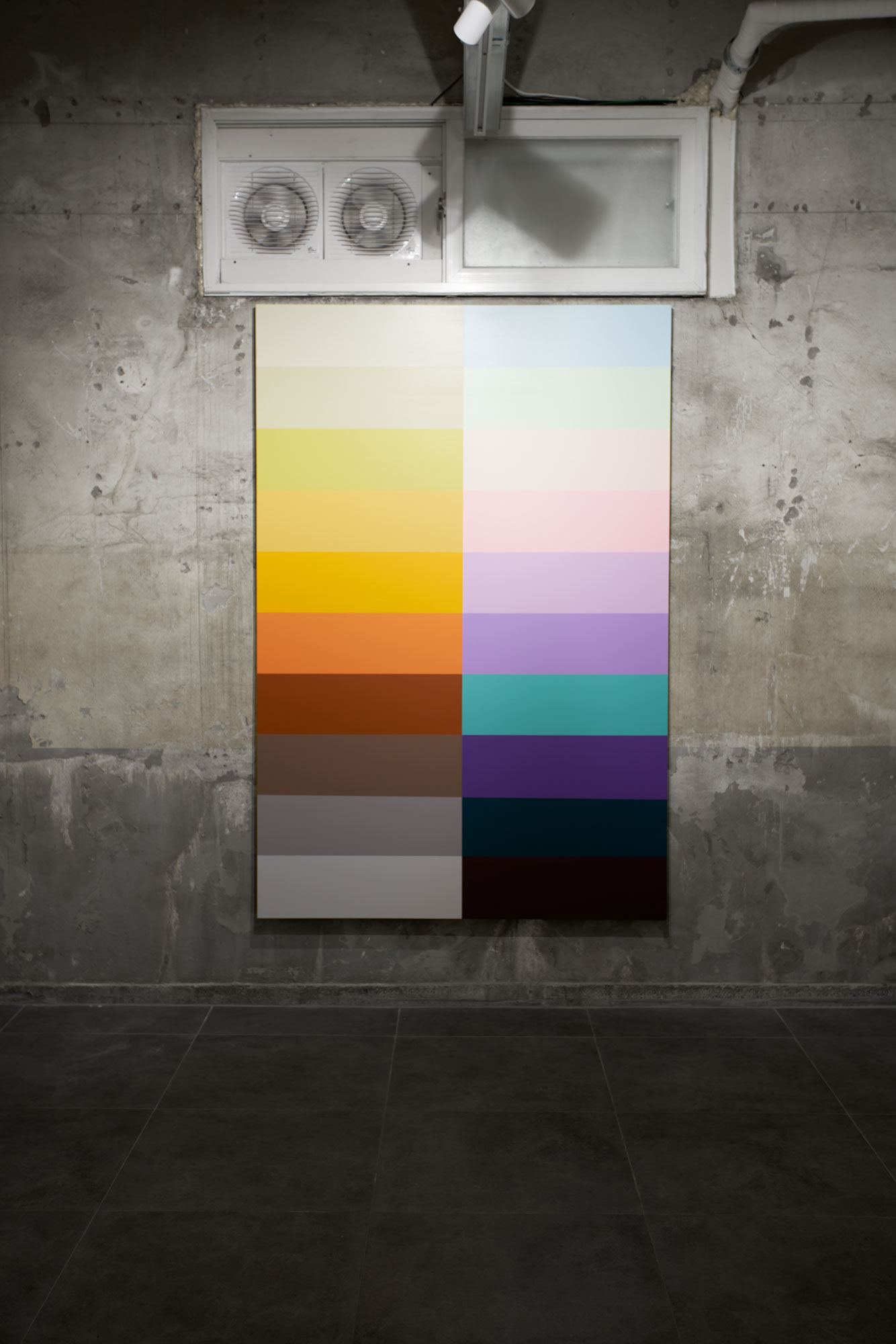
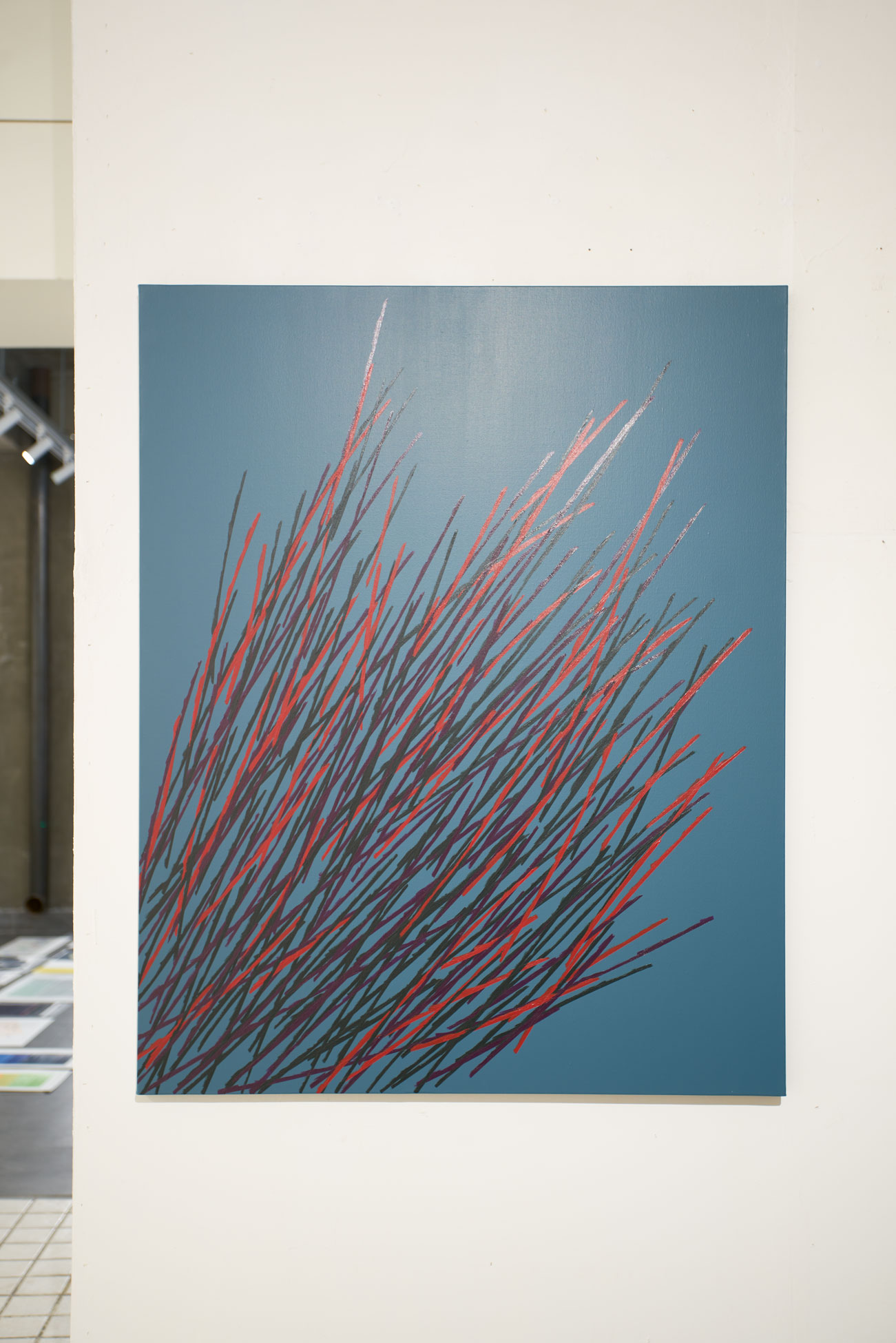
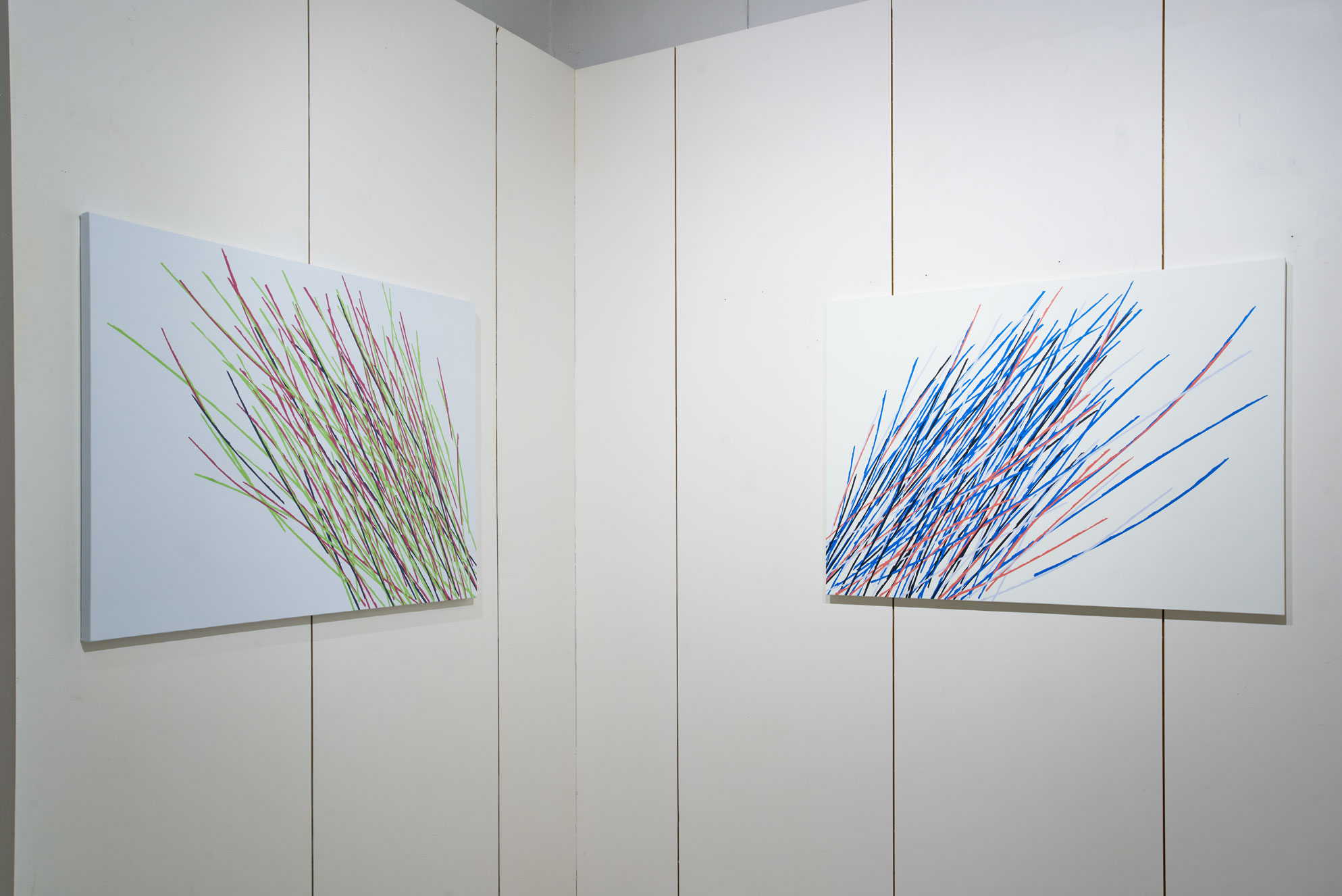
세 개의 수평 구성 – 3 horizontal configurations
세 개의 수평을 위한 수직 구성 – 3 vertical configurations for horizontal
감정-색의 섬세한 전이 과정을 통해 심리적 평정을 찾고 싶었다. 수평은 나에게 그런 것이다. 수직도 수평을 위해 존재한다.
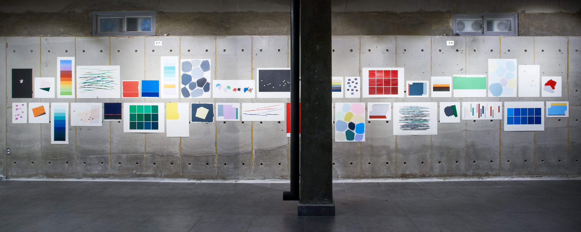
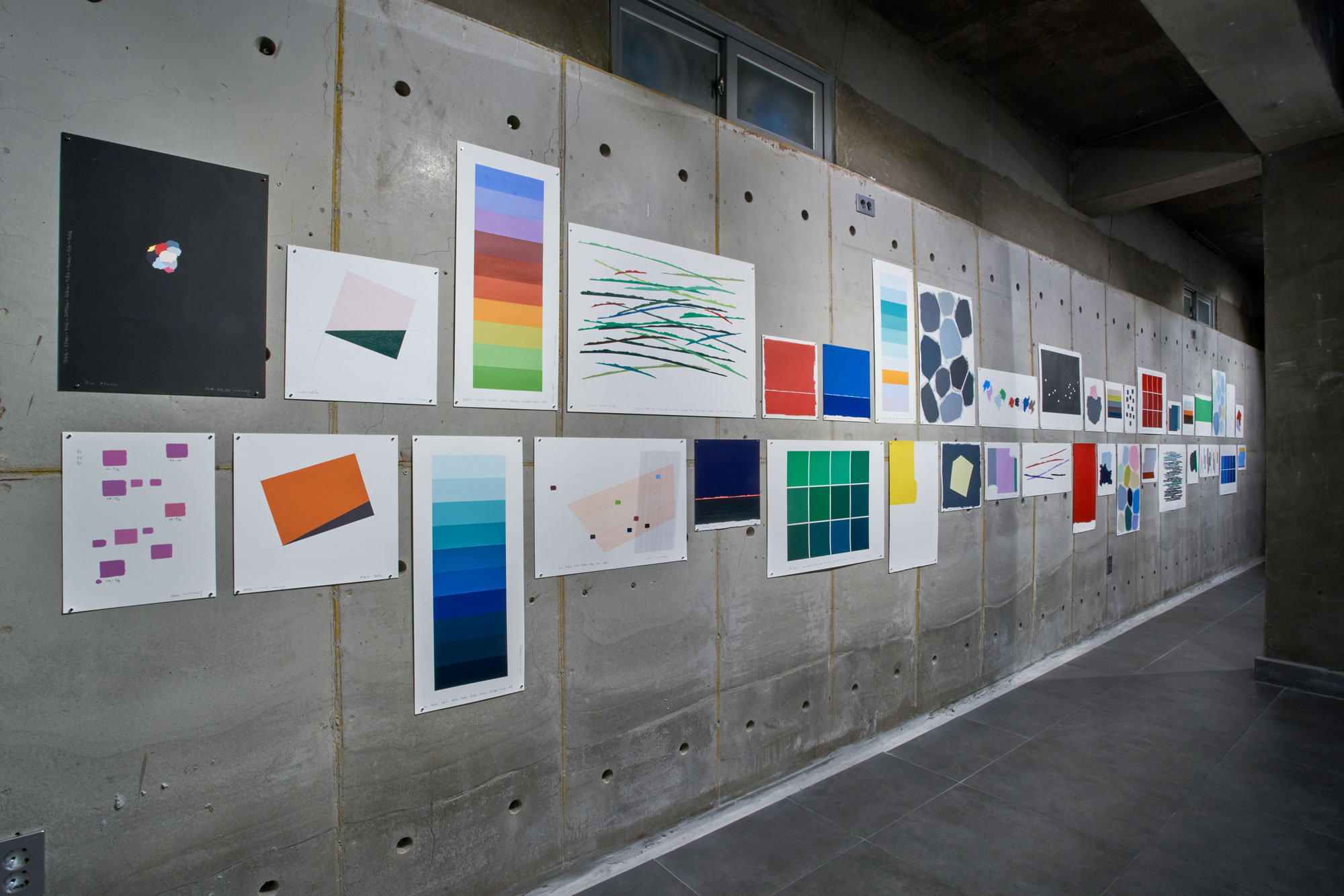
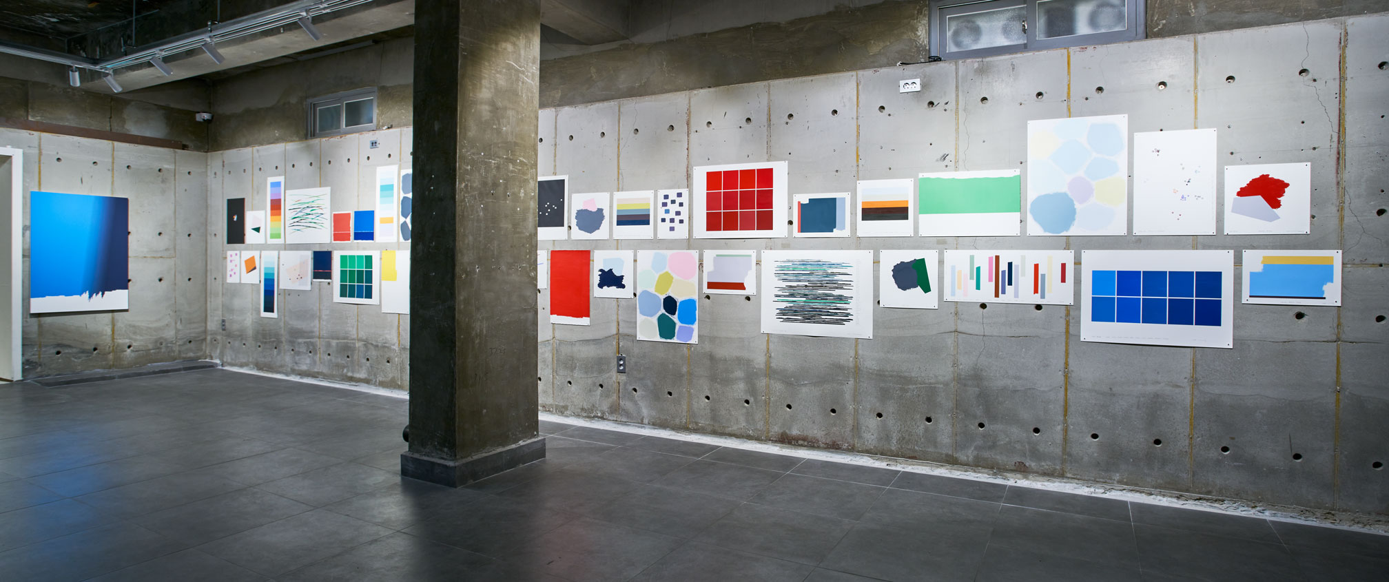
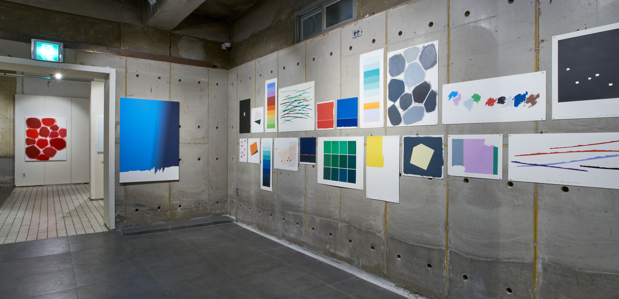
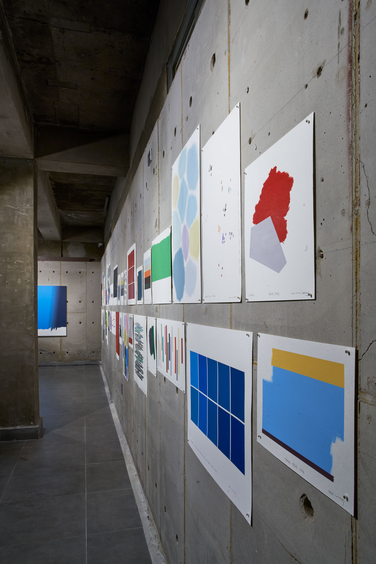
Drawing Wall
새로운 영감을 받을 때마다 가장 먼저 종이 위에 작업을 한다. 만족할 만큼 완성되면 종이 위의 작업은 캔버스로 보다 크고 섬세하게 옮겨진다. 때론 종이 위의 작업만으로도 충분할 때가 있고 어떤 경우엔 종이작업을 거치지 않고 캔버스 위에 직접적으로 작업하기도 한다.
종이 위에 작업은 그래서 나에겐 영감을 받은 그 순간의 원재료와 같다. 재료비에 얽매이지 않고 하고 싶은 모든 실험을 할 수 있기 때문에 작업하면서 자유로움을 느낀다.
Color as Adjective—Red, Blue, Green
Until now, I have explored color as adjective to describe my subjective and unclear emotions. The relationship between color and emotion recorded over the ten years since my first attempt in 2012 can experiment with various color relationships depending on what concept is established.
The first thing that came to mind as color as adjective—noun is beauty. Modern Korean society is volatile and dynamic, but my personal life as an artist, as shown by color as adjective, was sometimes joyful but mostly filled with uncomfortable and depressing experiences. Moments of joy scatter briefly in the air, and melancholy rises from deep within. Anger blurs vision as if dyeing it red, and anxiety about the future spreads throughout the body, offering sleepless nights.
When I looked back at the approximately 370 colors as adjectives recorded in this way, the color-beauty I had been trying to find was there. Painful, wistful, hopeless, foolish, kind, and sometimes peaceful daily life. The combination of emotions I could feel because I am alive and colors I could see with my heart—beauty.
This time, I exhibit the nouns red, blue, and green that explore the essence of color.
Colors appear different according to light. They also appear different depending on who looks at them and when. What is important to me is not the exploration of color as a physical property, but how it feels to me now. This feeling is very fluid, unclear, and ambiguous. That’s why it’s an adjective. The relationship between color and emotion created in this way is defined as red, blue, and green. This definition is one that can change in the future; it is a definition up to the present.
For me over the past ten years, [Red] has been the color of pretty, voluptuous, desperate, fortunate, stimulated, hot, moving, enthusiastic, ecstatic, heartbreaking, disgusting, and tingling.
For me over the past ten years, [Blue] has been the color of clear, curious, envious, dignified, reverent, wondrous, solemn, noble, lonely, unfamiliar, chilly, and noisy.
For me over the past ten years, [Green] has been the color of abundant, spine-chilling, grotesque, fresh, calm, refreshing, strong, rich, excessive, anxious, regretful, and resilient.
Three Horizontal Configurations Three Vertical Configurations for Horizontal
I wanted to find psychological equilibrium through the delicate transition process of emotion-color. The horizontal is that for me. The vertical also exists for the horizontal.
Drawing Wall
Whenever I receive new inspiration, I first work on paper. When it is completed to my satisfaction, the work on paper is transferred to canvas, larger and more delicately. Sometimes the work on paper alone is sufficient, and in some cases I work directly on canvas without going through paper work.
Work on paper is therefore like the raw material of that moment when I received inspiration. I feel freedom while working because I can do all the experiments I want without being bound by material costs.
전시 도록 | Catalog

・ 형용사로서의 색채 8 | Color as adjective 8
・ 전시 전경 | Exhibition view
・ 작품 이미지 | Images of works
・ 작가 노트 | Artist’s note
・ 64p