더 갤러리 호수 개관전 – The Gallery Hosu Opening Exhibition
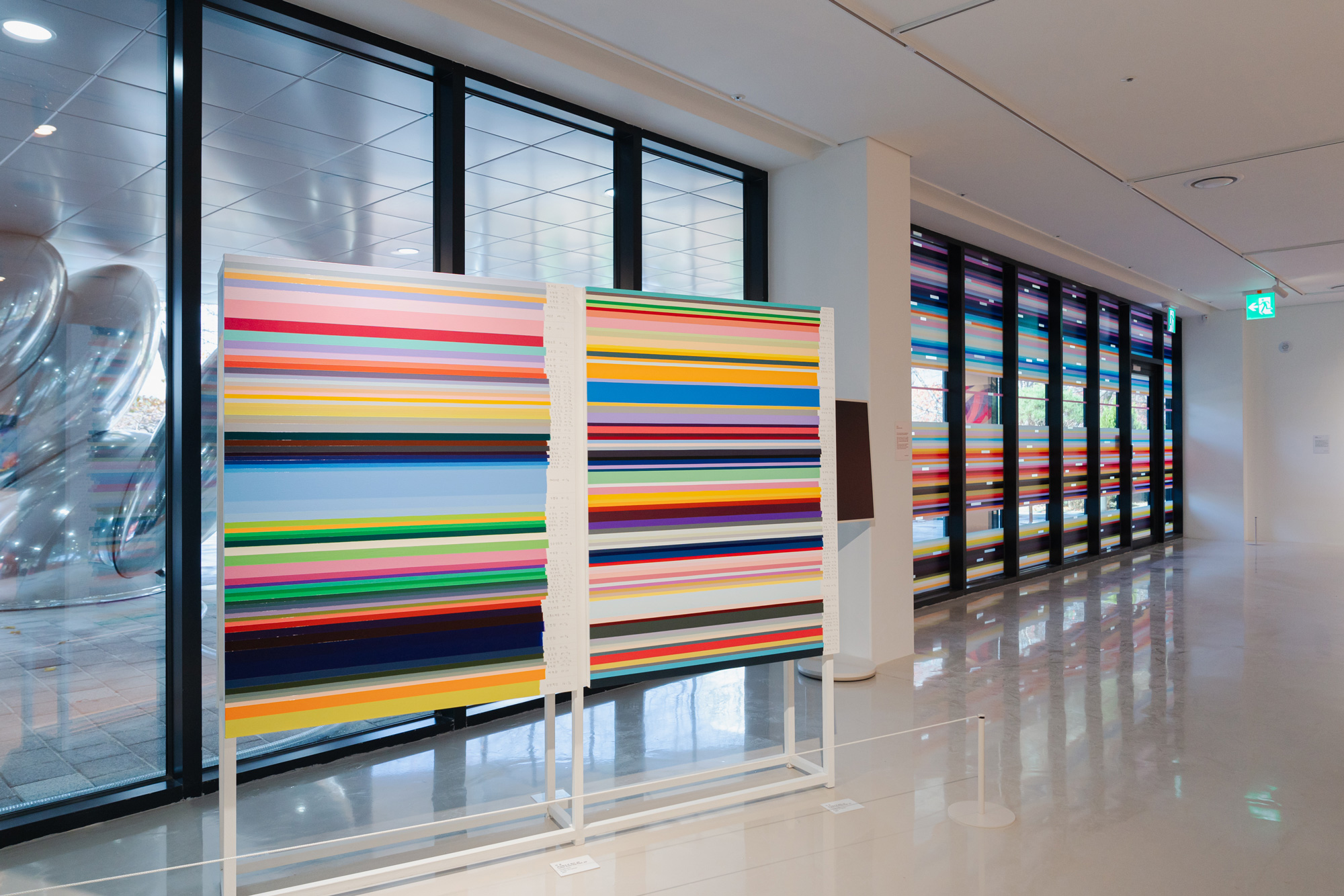
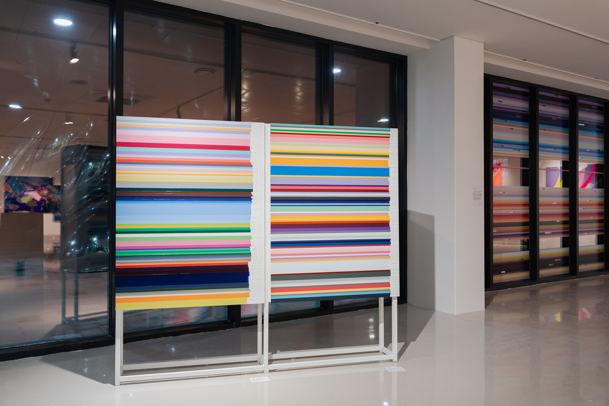
2 전시실 [into the colors] 이경, 제이미 리, 하태임
2 Exhibition Room [into the colors] Lee Kyong, Jamie Lee, Ha Tae-im
Nov. 22. 2024 ~ Feb. 28. 2025
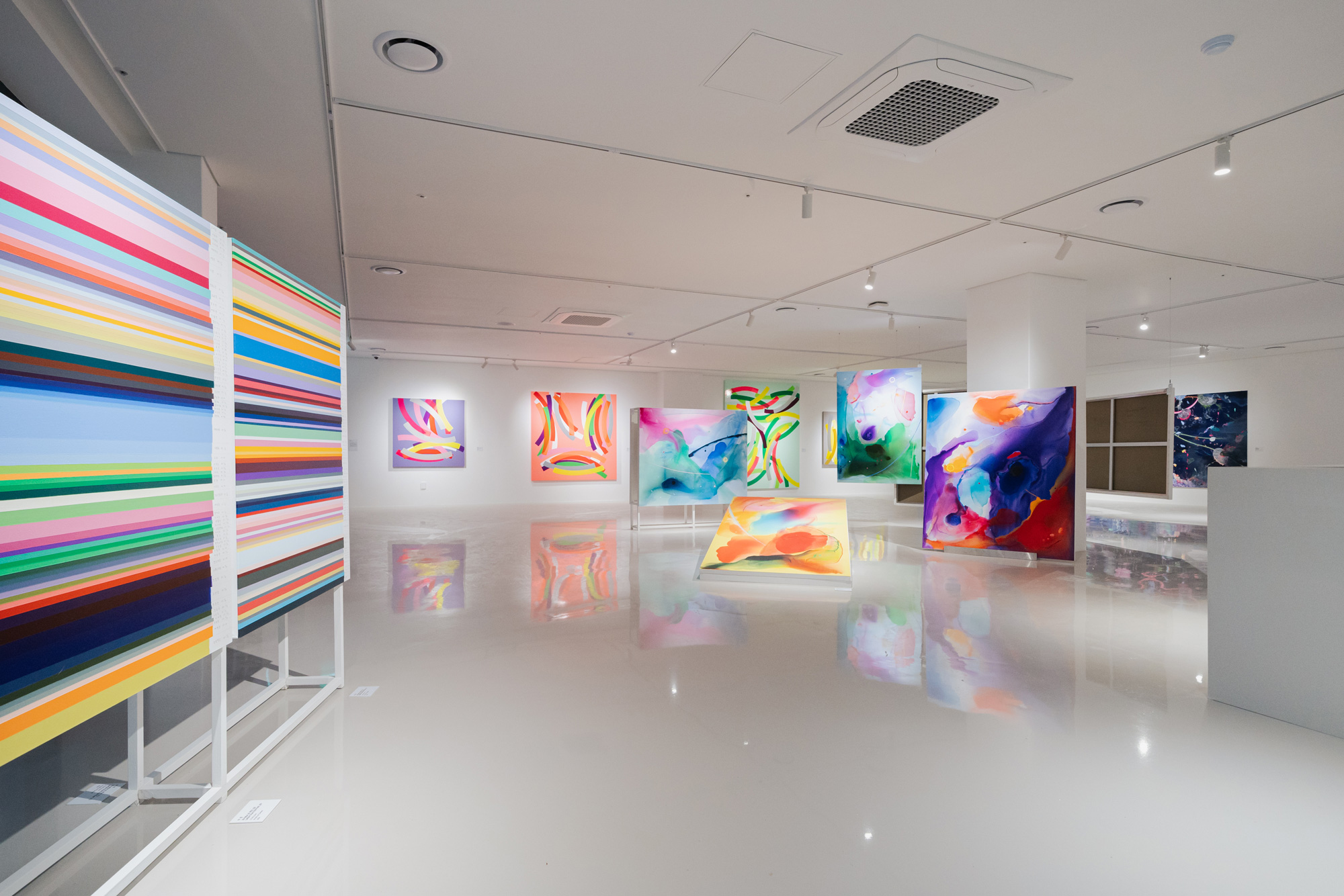
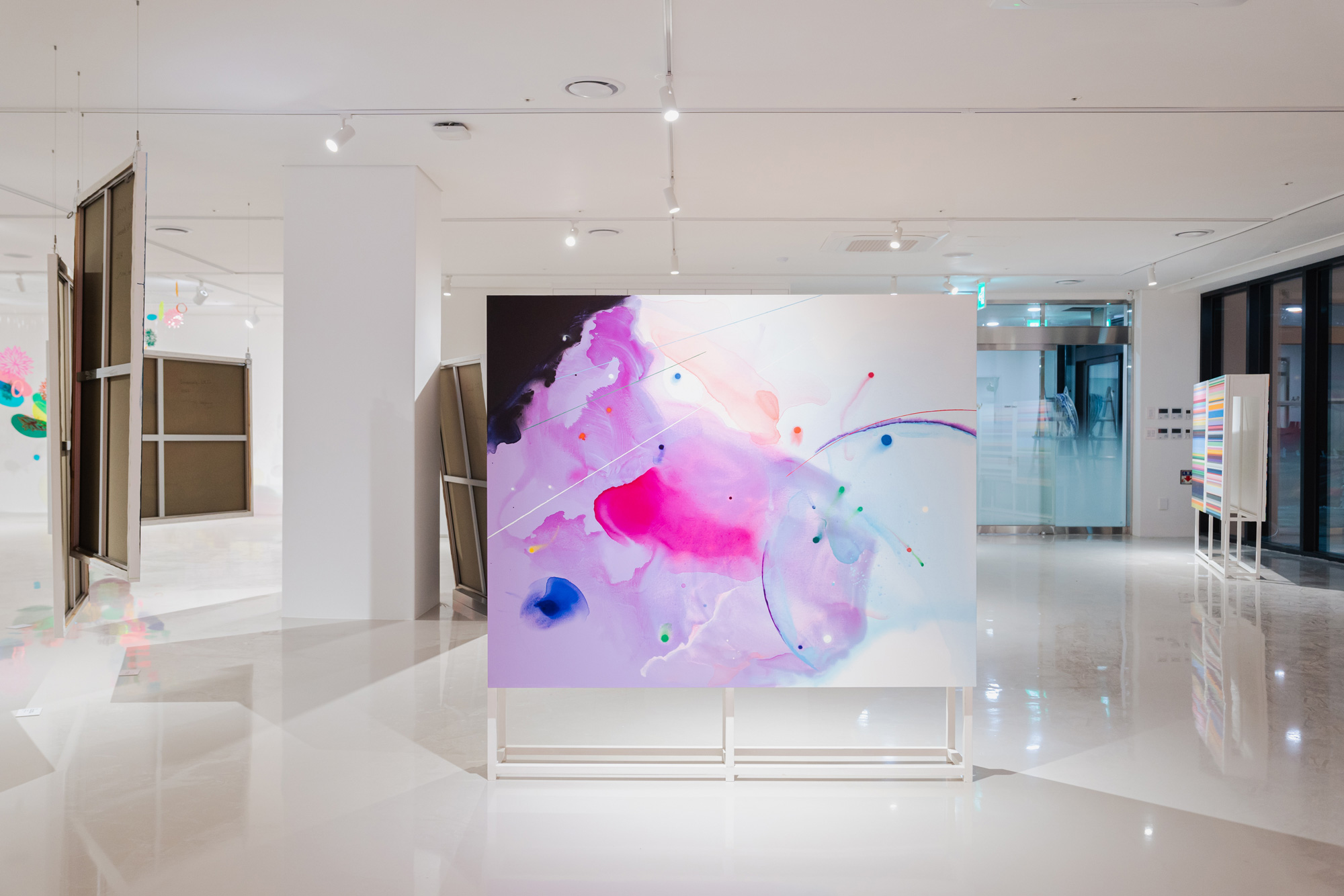
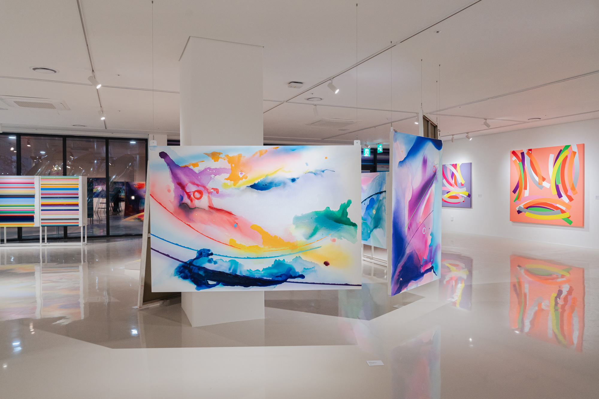
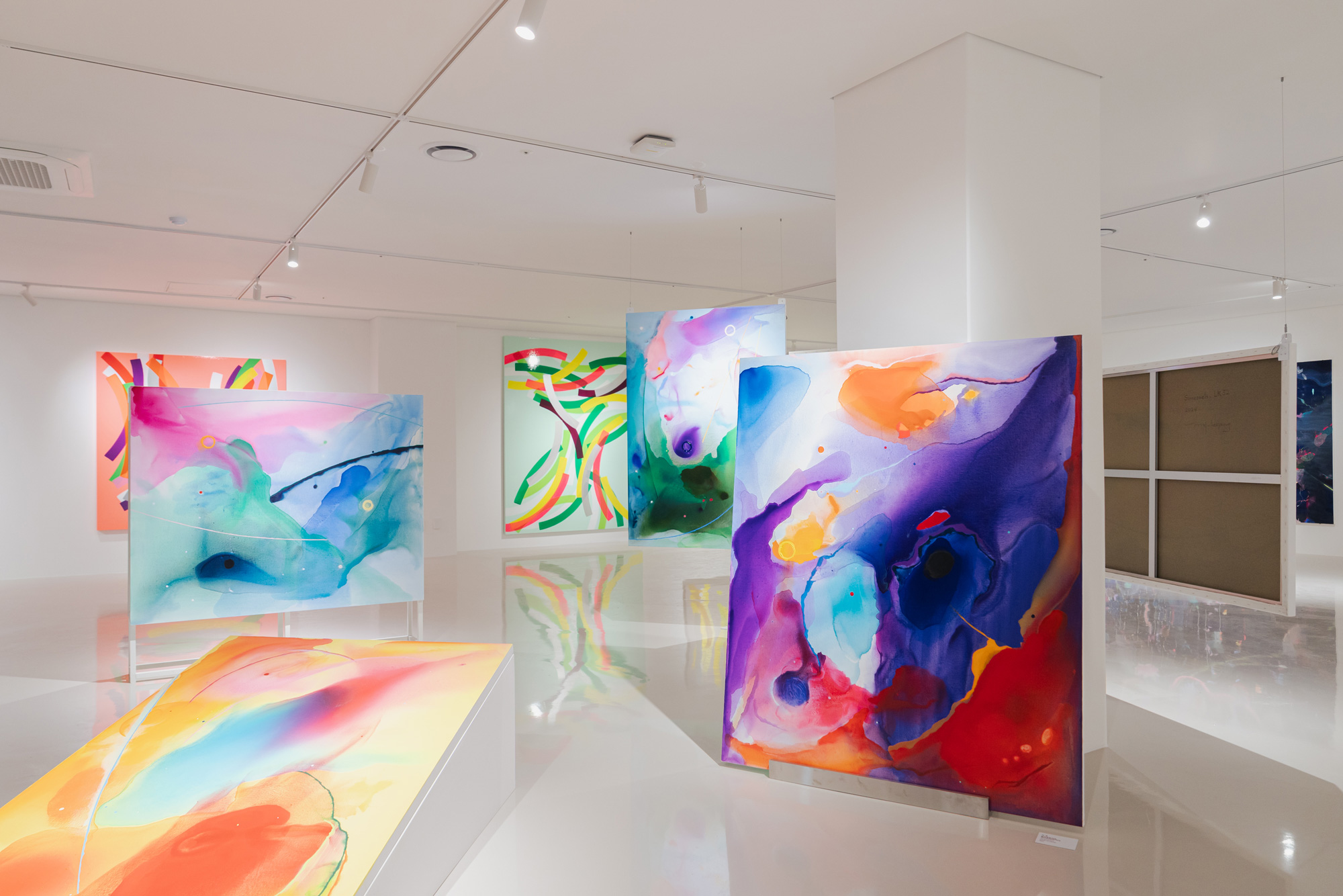
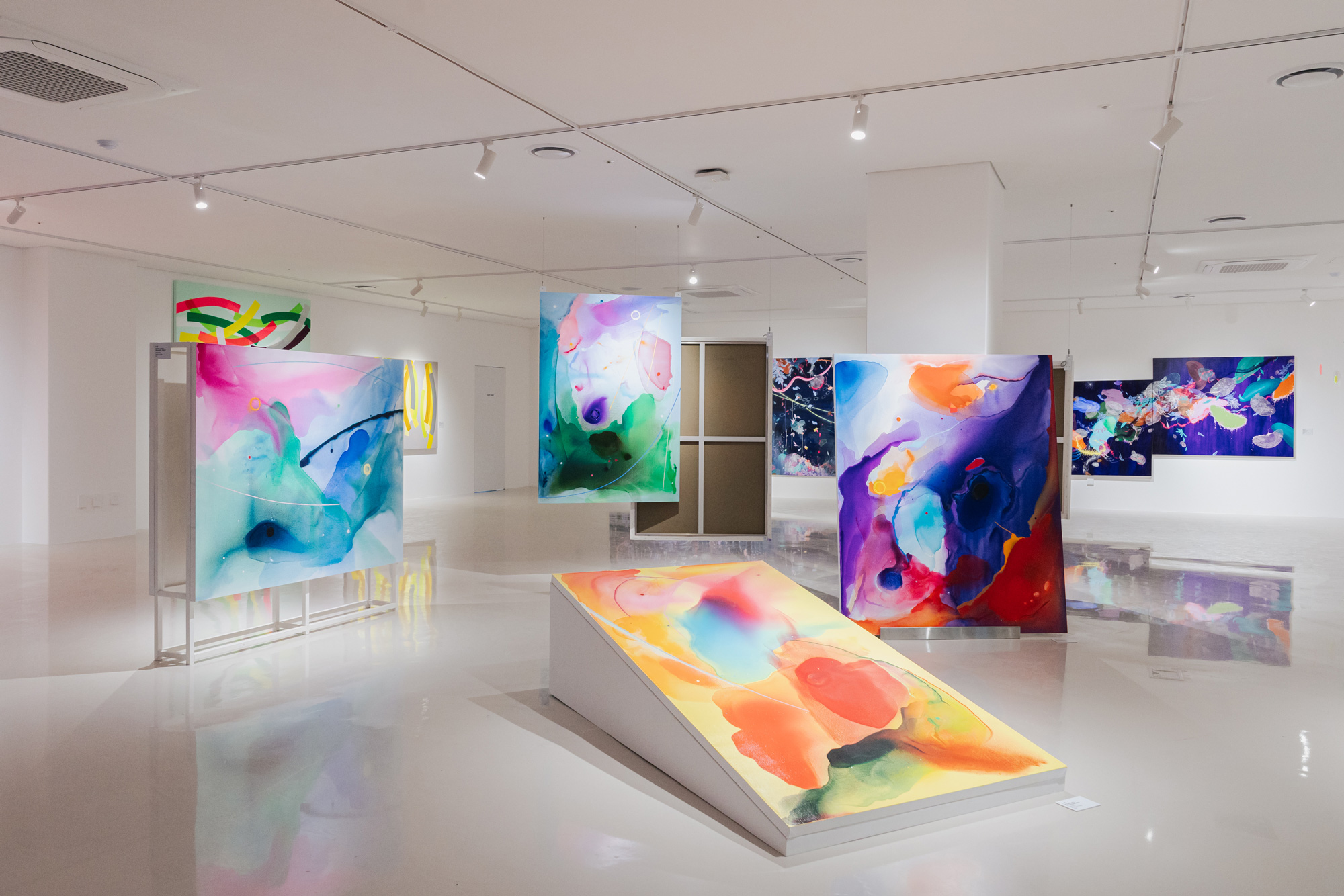
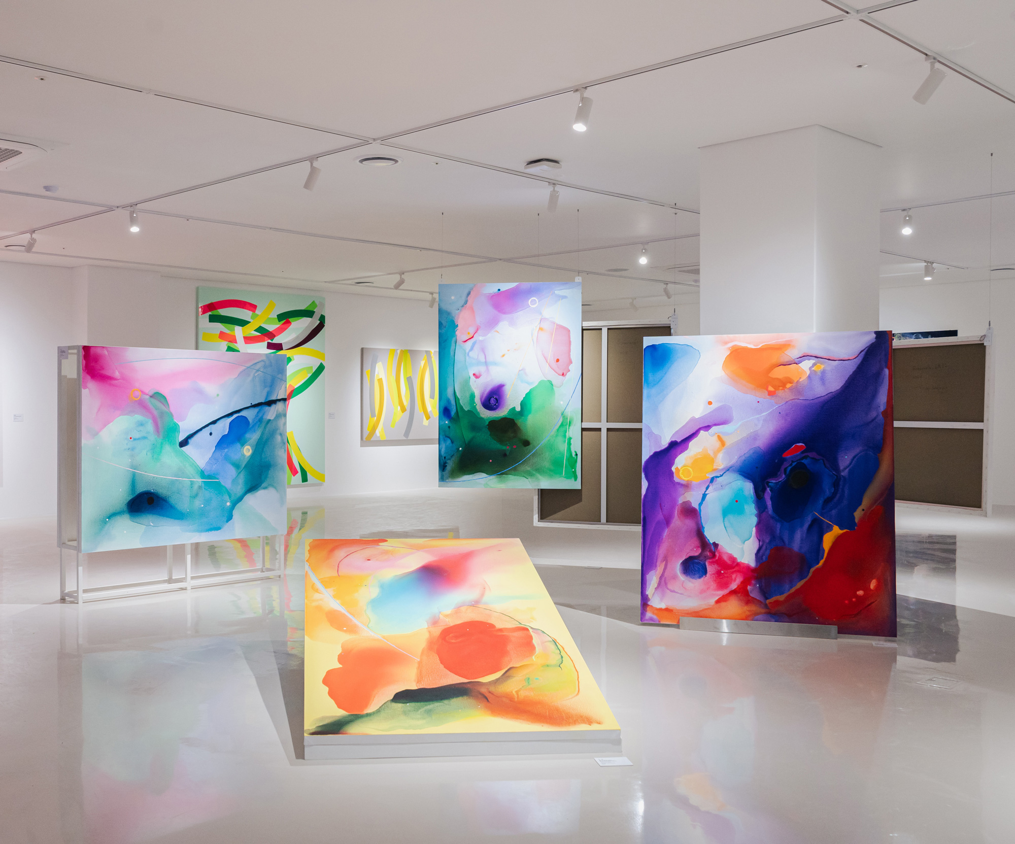
감각세계 / Sinneswelt
2024, Acrylic on Canvas, Painting installation of 7 large-scale paintings
•형용사라는 언어의 한계와 무한한 색상 사이의 틈에 대 한 인식에서 출발했다.
•형용사로 만든 색채의 명도와 채도를 물을 이용해 조절 함으로써 우연이 색의 본질을 변화시킬 수 있도록 의도 했다.
•캔버스 위에서 펼쳐지는 사건은 나의 감정이 담긴 색의 자유로운 흐름과 우연의 상호작용 속에서 내가 인식한 세계에 대한 재해석이다.
•감각세계와 정신세계의 이분법적 구조가 아닌, 현 시대 성을 반영하는 감각-의미라는 보다 넓은 해석(인간의 신체적 오감과 함께 언어, 사고, 자아, 사회적 감각 등)에 기반한다.
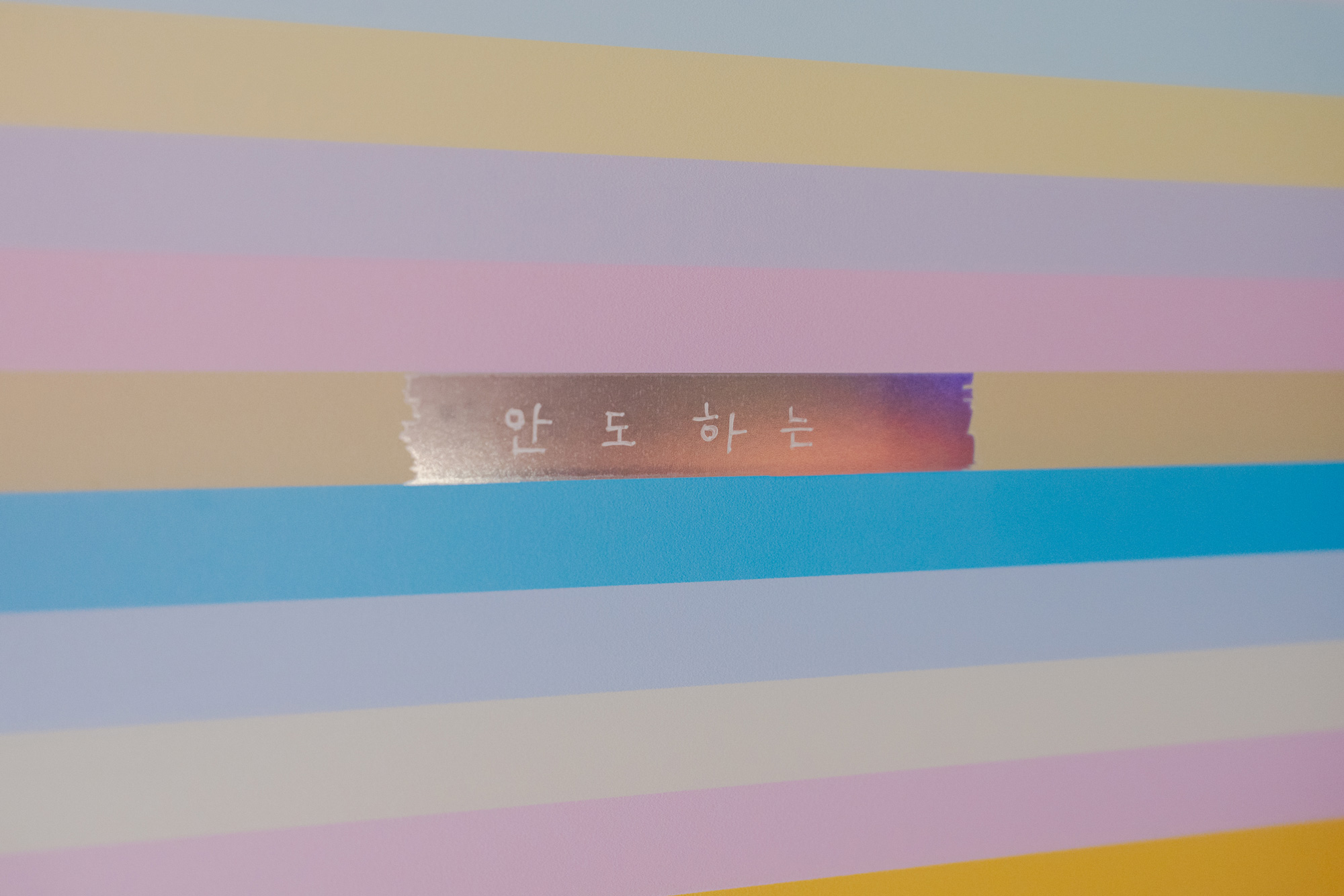
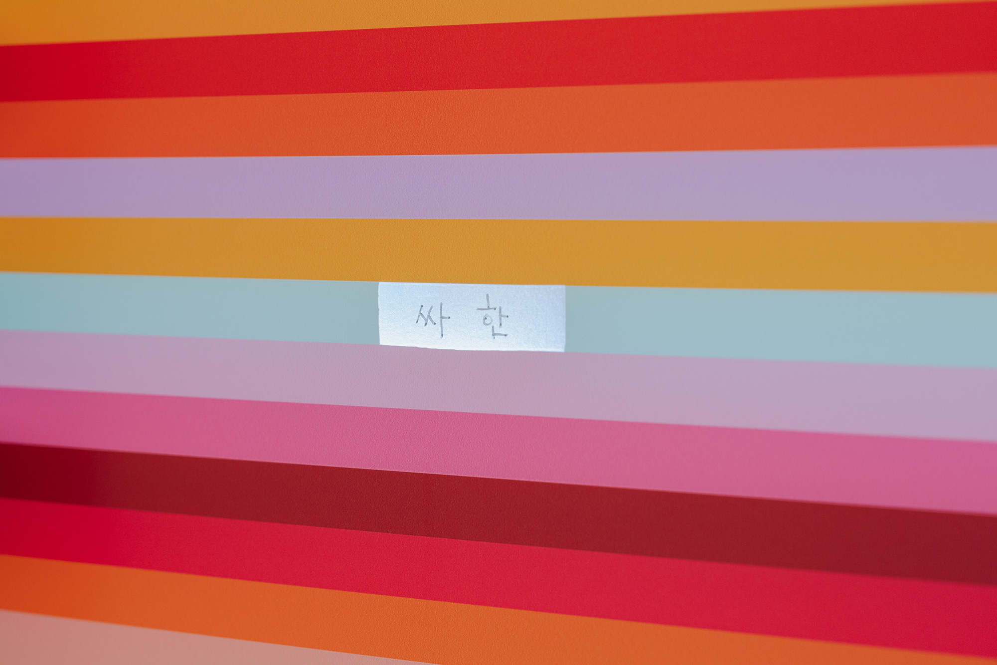
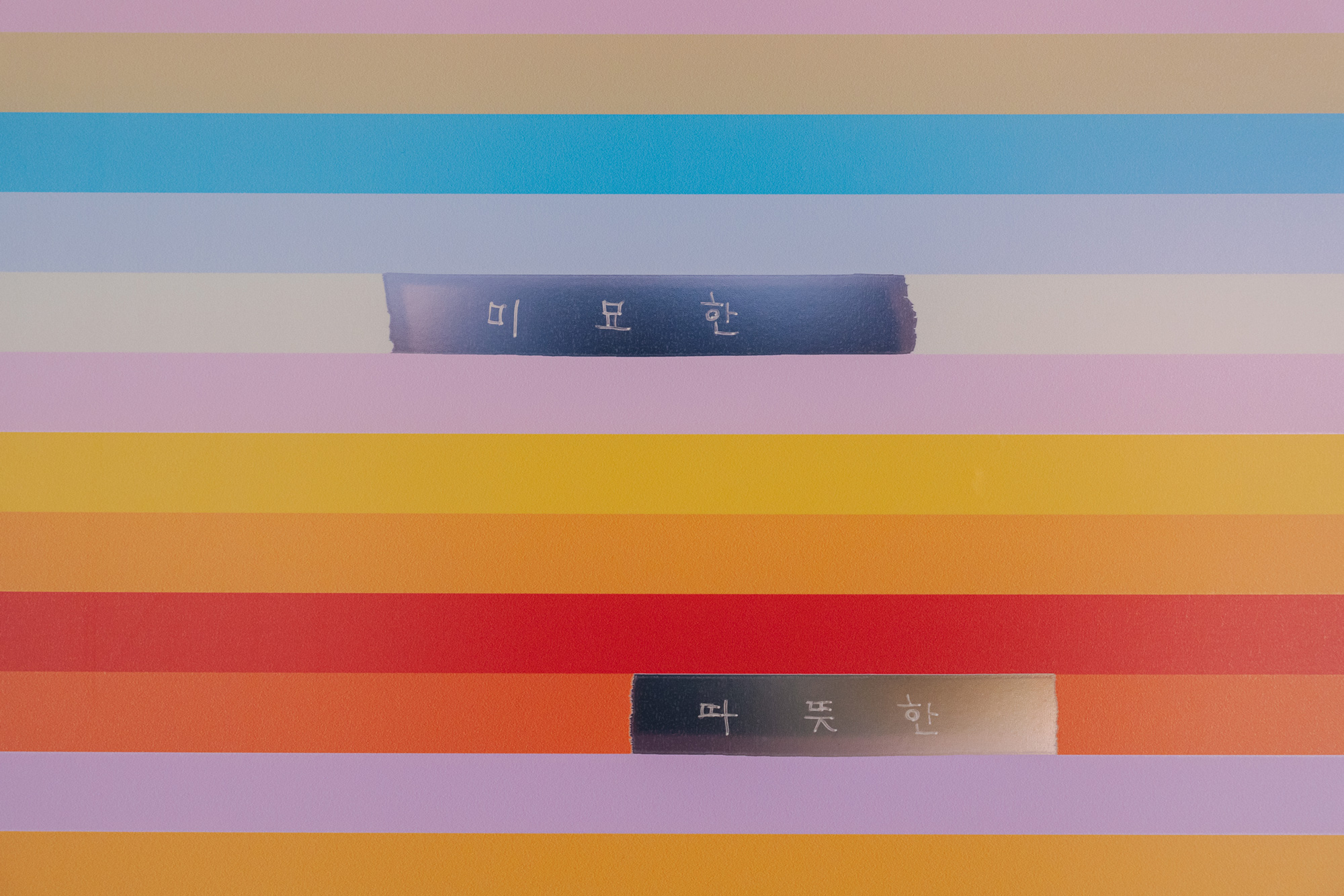
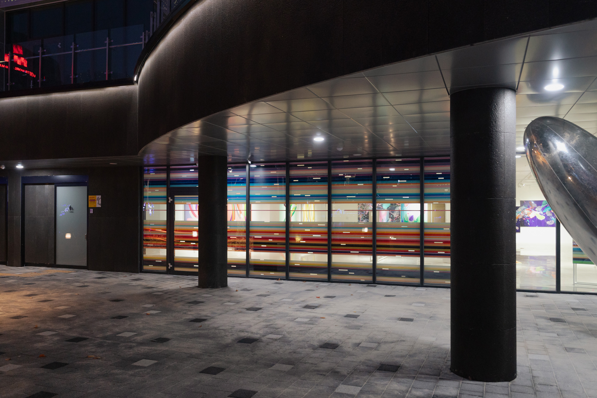
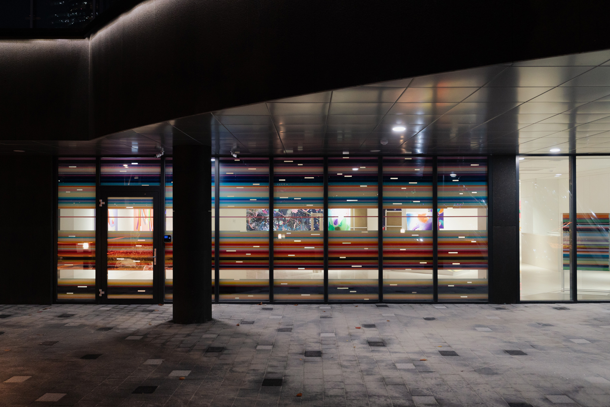
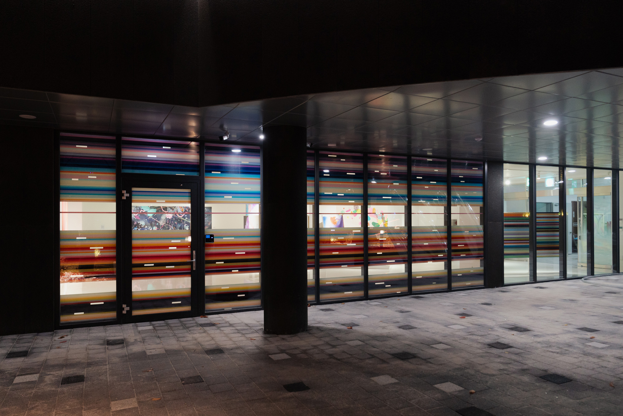
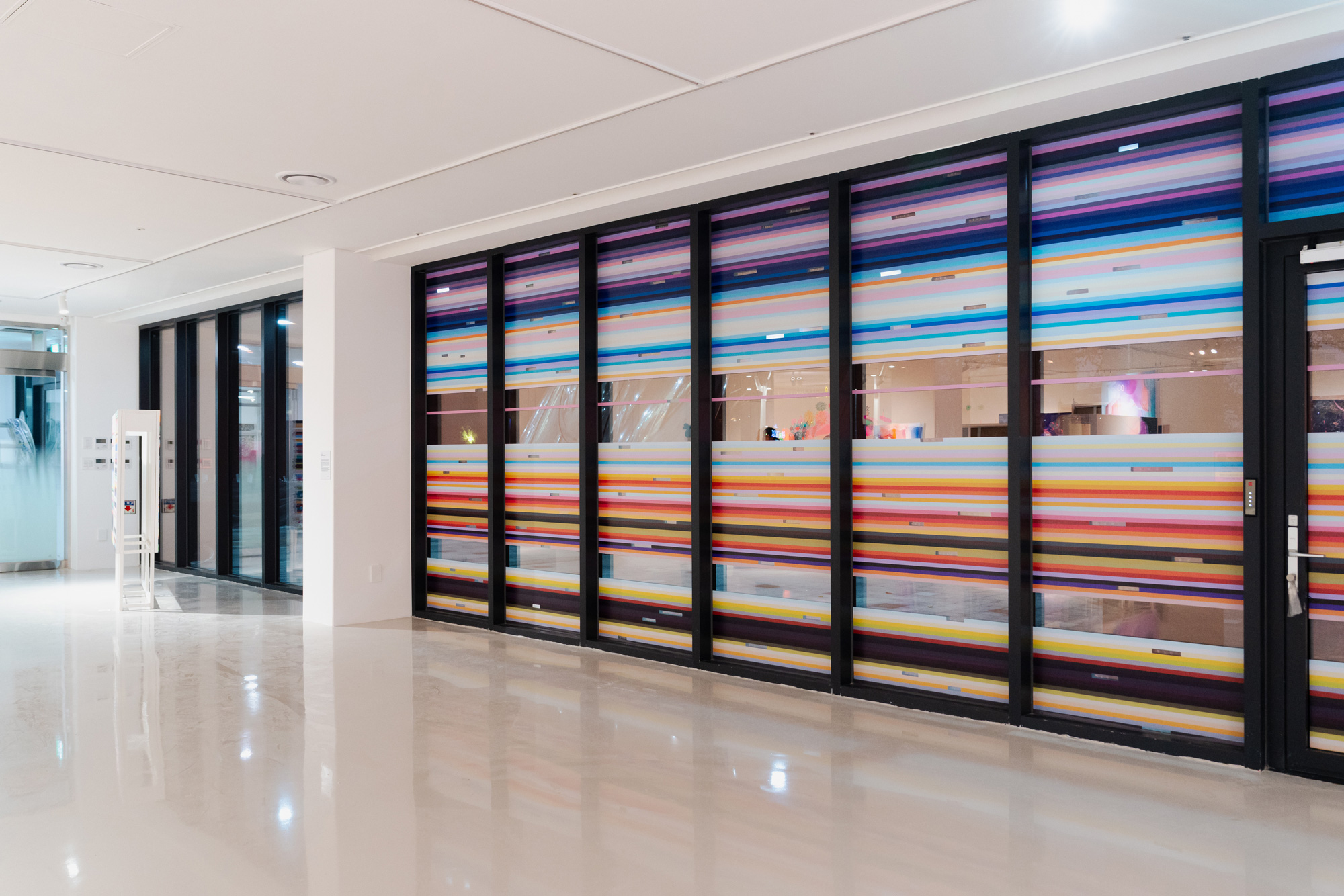
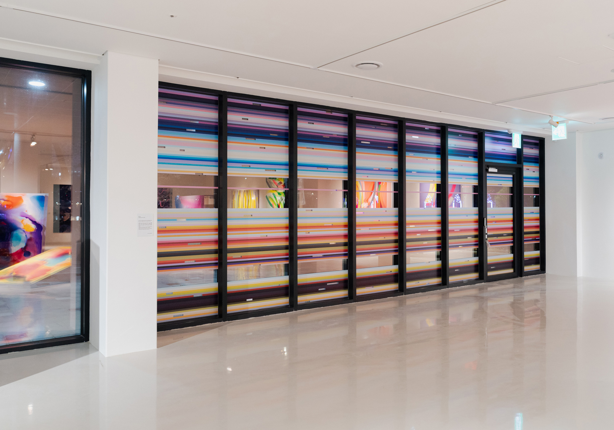
Site-specific Glass Window Project_과거에서 온 편지-104
2024, 261.5×745.8cm, Dual color printing and Handwritten transparent sheet on the glass
송파구청에서 새롭게 개관하는 더 호수 갤러리는 서울의 랜드마크 중 하나인 롯데타워가 있는 석촌호수변에 자리잡고 있다. 호수 주변을 산책하는 유동인구가 하루 10만명에 이른다고 한다. 산책로에 접해 있는 갤러리로 그들의 흥미를 유발하기 위해 8개의 유리창에 나의 작업 중 하나인 과거에서 온 편지를 디지털화하여 설치한다. 전체 유리창을 가리는 것이 아니라 산책자의 시선 높이에서 3군데를 투명하게 남겨두어 밖에서 안의 갤러리 전시 상황을 볼 수 있도록 구성했다. 또한 나의 형용사로서의 색채의 단어를 아크릴 펜으로 수기 작성하여 산책로에서 보았을 때 어렴풋하게 보이는 반전된 글자를 보고 갤러리 안으로 들어와 색의 이름을 올바르게 읽으며 전체 그림을 감상할 수 있도록 구성하고자 했다.
겨울 전시임을 고려하여 따뜻하고 포근한 느낌의 색채를 선별하고 색상의 지루한 전개를 방지하기 위해 준보색을 적절히 배치했다. 관람자는 차가운 날씨에도 산책을 즐기며 회색빛 도시의 색채와 대비되는 색의 전개를 함께 즐기며 나의 감정색으로 명명된 언어의 의미를 다시 한번 생각해보는 계기가 되기를 바란다.
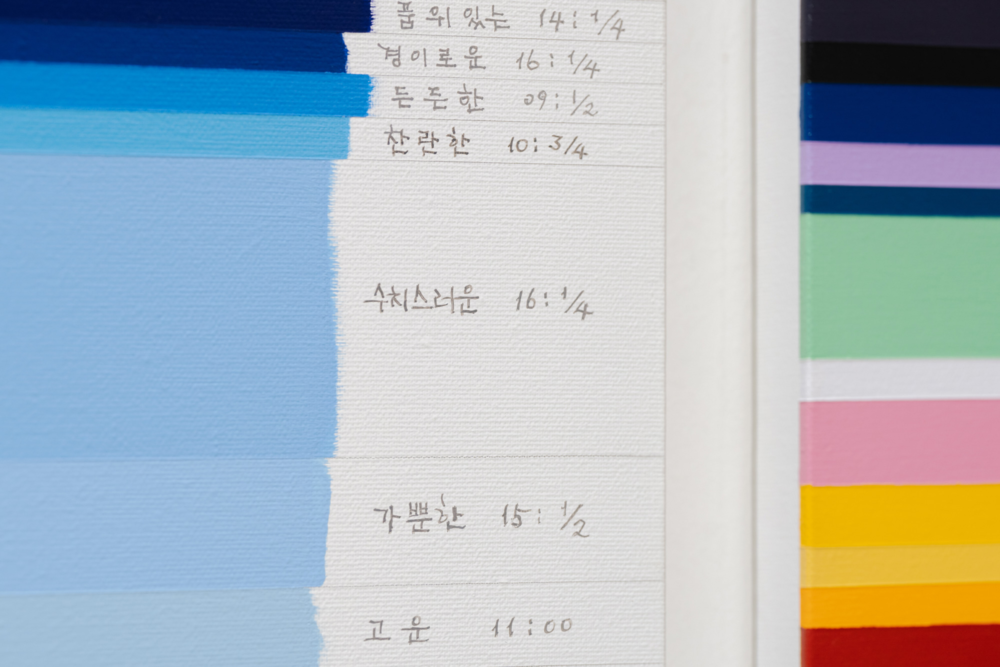
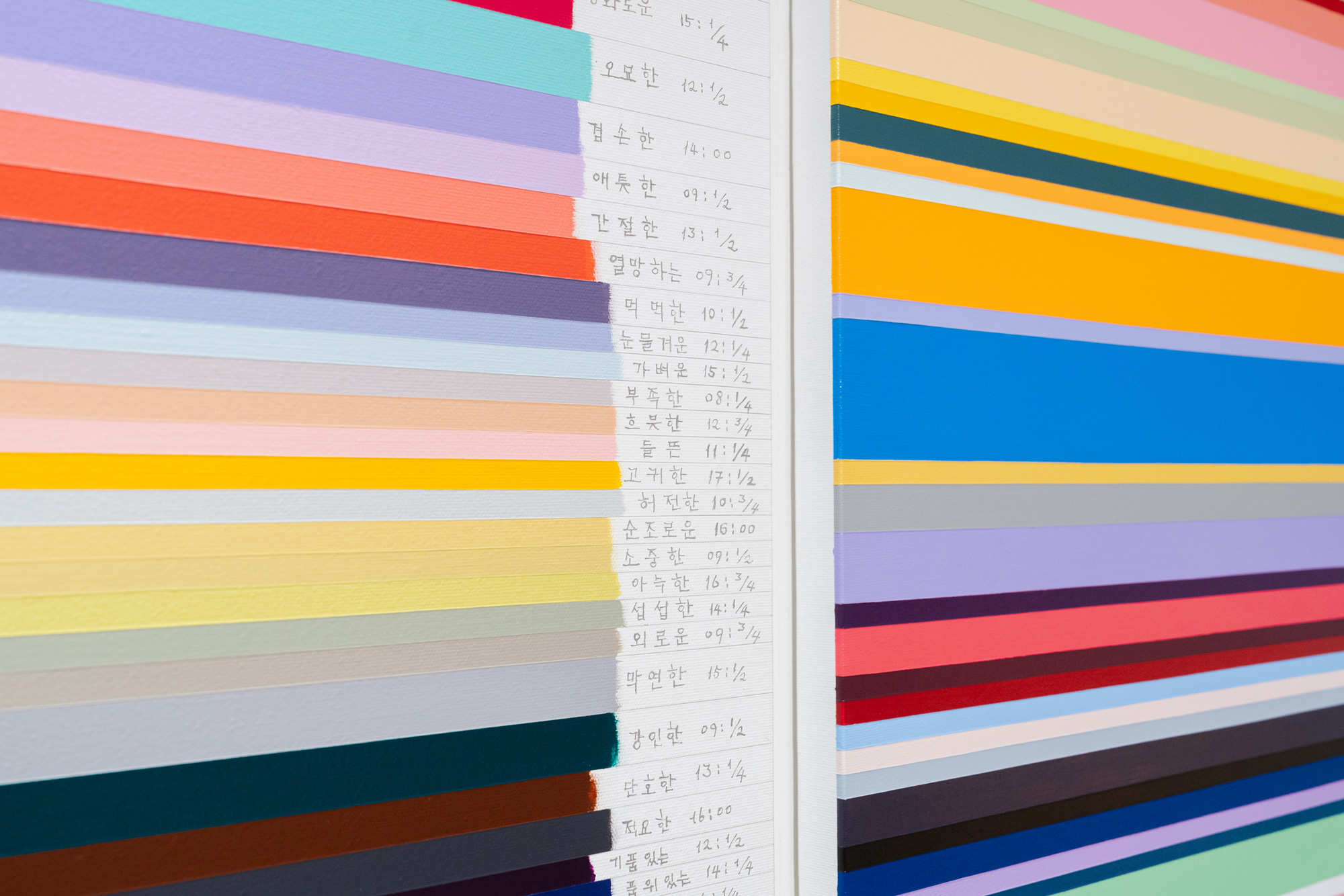
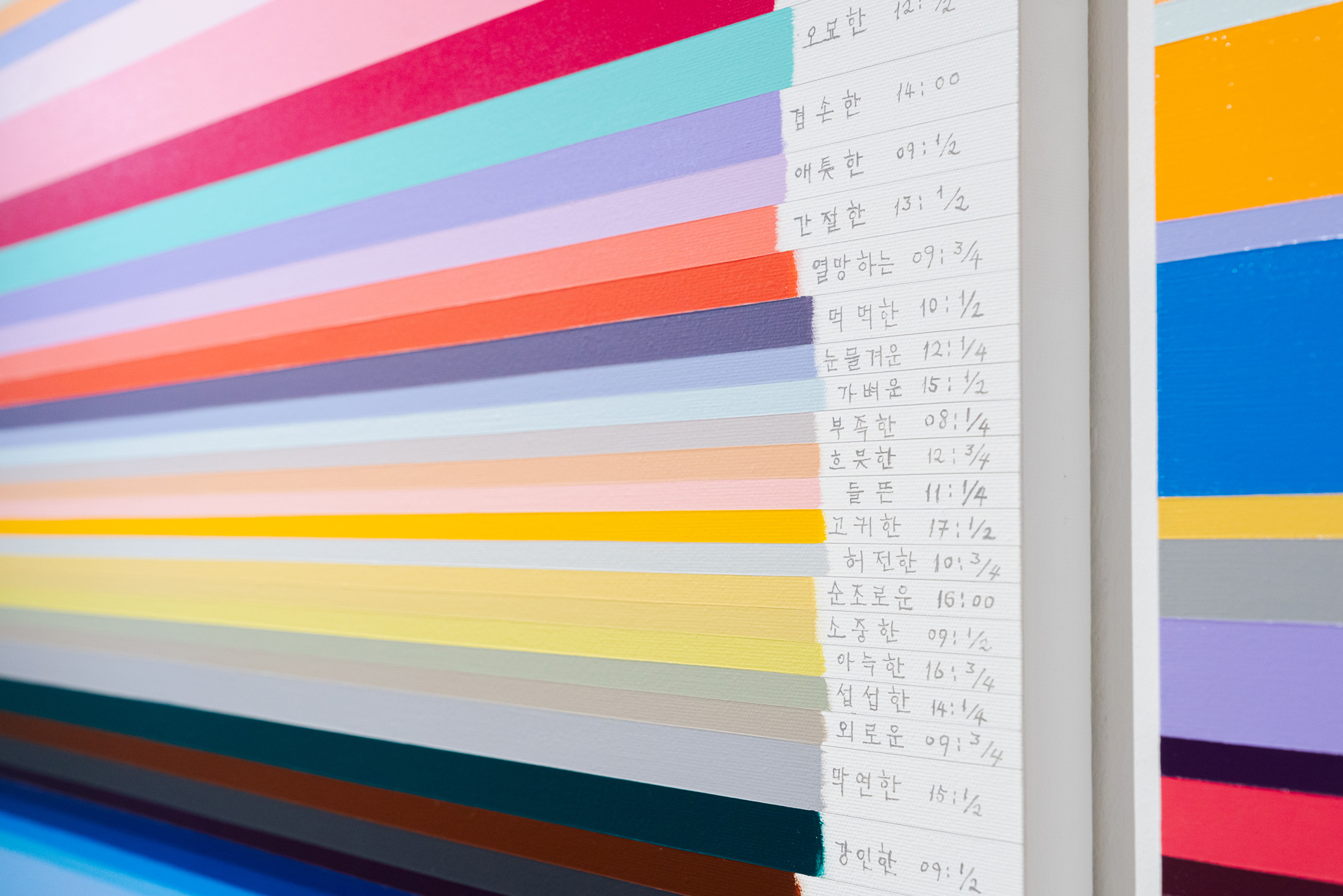
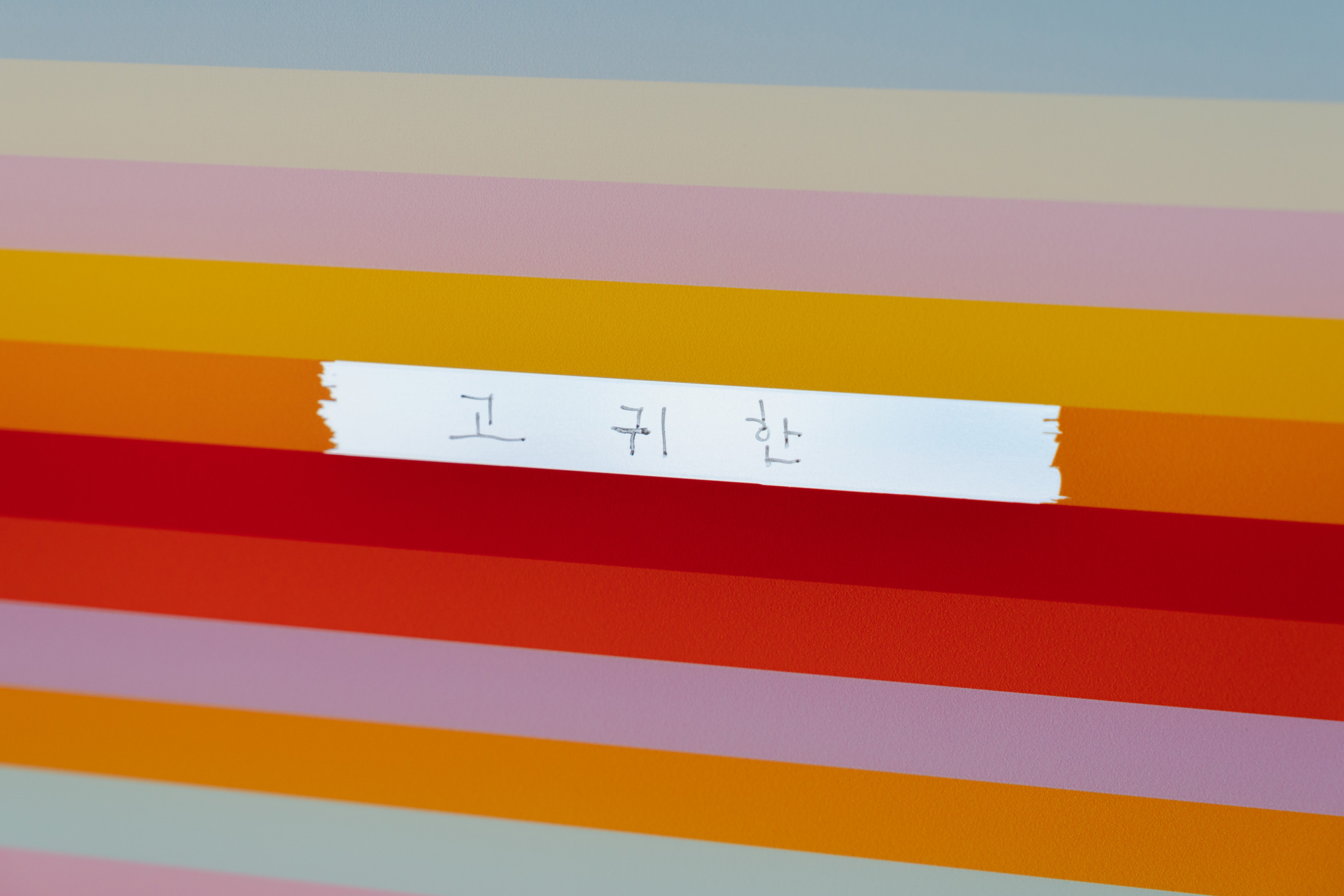
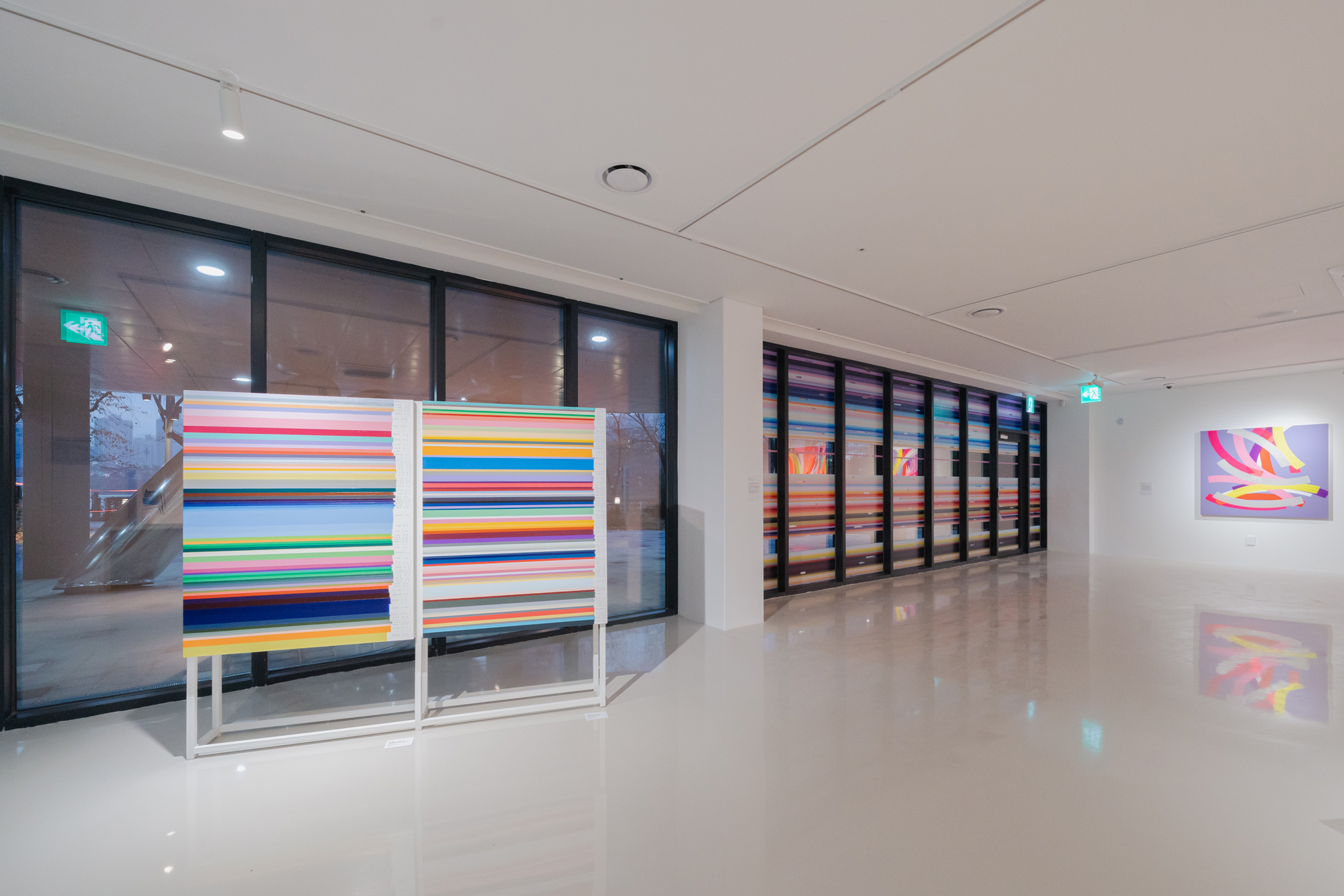
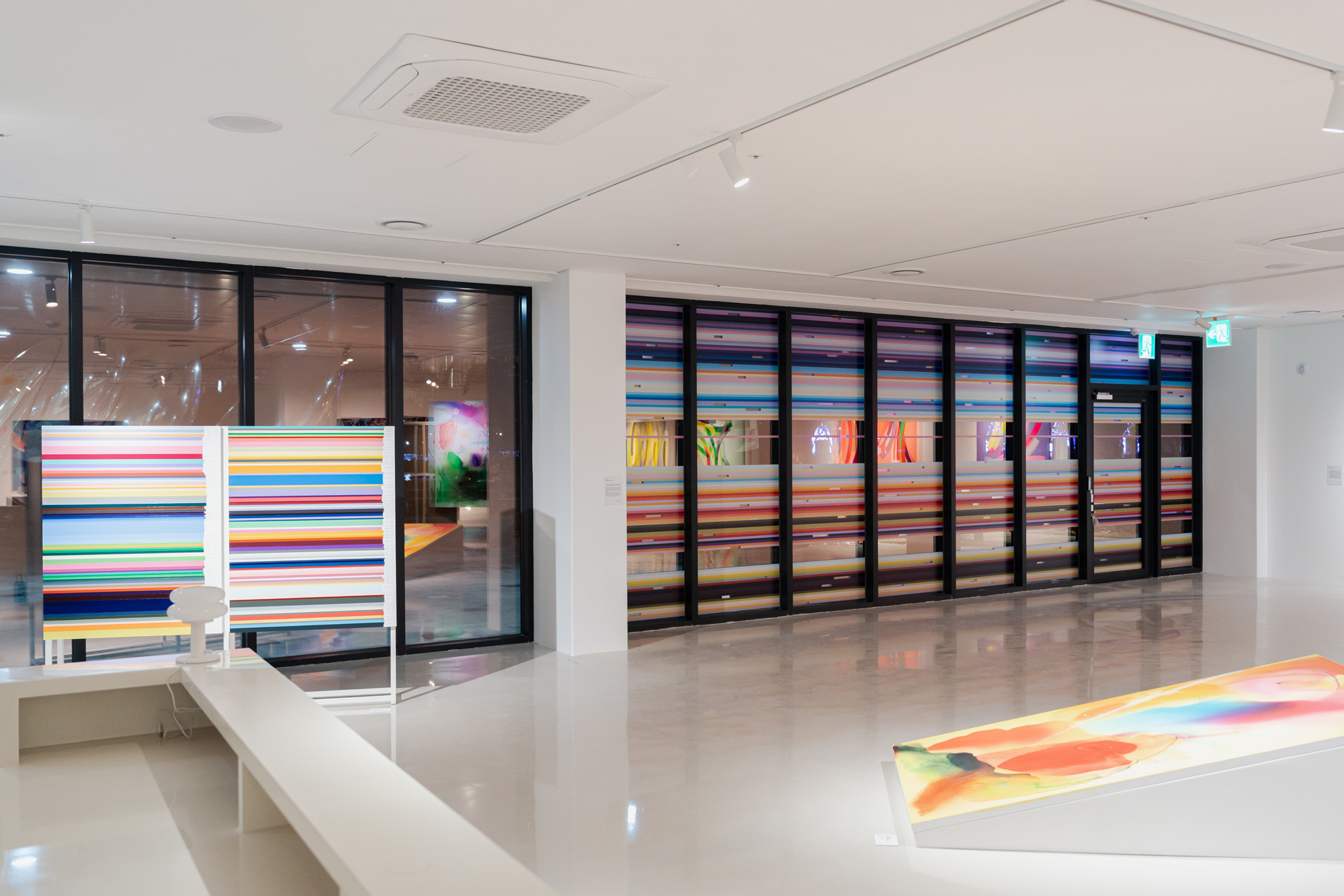
과거에서 온 편지 시리즈 / Letters from the Past series
2024, Acrylic on Canvas, 117×91.5cm, Install the canvas like the two sides of a book, front and back, 2 each
과거에서 온 편지-108 작업을 완성하고 난 후 나는 좀 더 작은 캔버스 위에 불규칙한 높이의 색면을 쌓고 오른쪽에 그 해당 단어를 손글씨로 적었다. 단순한 컬러필드 색면을 탈피하기 위한 방법으로 색의 형용사 이름과 그것을 완성한 시간을 대략적으로 적었다. 정확하게 14:47분이 아닌, 14: 3/4이라고 쓰는 이유는 내가 색면을 그리고 시계를 찾는 15분 정도의 여유를 주기 위해서다. 타인에게 특별한 의미를 가진 숫자는 아니다.
그림 제목의 72, 77이나 82개의 색들은 제한된 캔버스의 크기 내에서 색과 의미를 고려하며 색면의 높이를 다르게 조절했기 때문에 색의 갯수는 우연하게 그려졌다.
Sensory World / Sinneswelt
2024, Acrylic on Canvas, Painting installation of 7 large-scale paintings
• It started from an awareness of the gap between the limitations of language as adjectives and infinite colors.
• By adjusting the brightness and saturation of colors created as adjectives using water, I intended to allow chance to change the essence of color.
• The events unfolding on the canvas are a reinterpretation of the world I perceived within the interaction between the free flow of colors containing my emotions and chance.
• It is based on a broader interpretation of sense-meaning (human physical five senses along with language, thought, self, social senses, etc.) that reflects contemporary temporality, rather than a dualistic structure of sensory world and spiritual world.
Site-specific Glass Window Project–Letter from the Past-104
2024, 261.5×745.8cm, Dual color printing and Handwritten transparent sheet on the glass
The Lake Gallery, newly opened by Songpa-gu Office, is located by Seokchon Lake where Lotte Tower, one of Seoul’s landmarks, stands. It is said that the floating population of people walking around the lake reaches 100,000 per day. To attract their interest as a gallery adjacent to the walking path, I digitized and installed one of my works, Letters from the Past, on eight glass windows. Rather than covering the entire glass windows, I left three areas transparent at the eye level of walkers so that they can see the gallery exhibition situation from outside. Also, I hand-wrote the words of my “Color as Adjective” with an acrylic pen so that when viewed from the walking path, viewers would see the reversed letters that appear vaguely, then enter the gallery to read the color names correctly and appreciate the entire picture. Considering it is a winter exhibition, I selected colors with a warm and cozy feeling and appropriately arranged semi-complementary colors to prevent monotonous development of colors. I hope that viewers will enjoy their walk even in cold weather, enjoy the development of colors contrasting with the gray city colors, and have an opportunity to reconsider the meaning of language named as my emotional colors.
Letters from the Past series
2024, Acrylic on Canvas, 117×91.5cm, Install the canvas like the two sides of a book, front and back, 2 each
After completing Letter from the Past-108, I stacked color fields of irregular heights on smaller canvases and wrote the corresponding words by hand on the right side. As a way to escape simple color field planes, I roughly wrote the adjective names of colors and the time of their completion. The reason I write 14:3/4 instead of exactly 14:47 is to give myself about 15 minutes of leeway between painting the color field and looking at the clock. The numbers have no special meaning to others. The 72, 77, or 82 colors in the painting titles were drawn coincidentally because I adjusted the heights of the color fields differently while considering color and meaning within the limited canvas size.